Cryptocurrency Trading 101: Ultimate Bitcoin Investment Guide
Cryptocurrency Trading Part I: Building Blocks
The objective of this guide for bitcoin investors is to serve as a one-stop, all-encompassing tutorial and primer to familiarize even someone with no prior exposure or initiation in the subject with the intricacies of trading in cryptocurrency markets, or any market at large. Trading arcana is often portrayed to be as complex, mind-bending and unfathomable as quantum physics. Soon, you'll come to realize that it's pretty simple mathematics.
Table Of Contents
Jack Bogle, widely regarded as the greatest investor in American markets, was often criticized for lack of diversity in his portfolio. Bogle focused almost exclusively on low-cost, low-turnover, passively managed mutual funds in the United States. When asked of his blinkered, US-centric approach, he would protest the notion of any such bias and assert that he invested only in markets he was thoroughly familiar with.
Putting your money only into markets that you're familiar with is perhaps the primary precept in trading. Thus, before trading in cryptocurrency markets, it's imperative that one invests adequate time observing the methods and machinations typical of these curious wild-west markets. That is not to suggest that these markets are anything particularly unexampled within the historical context of financial markets.
Jesse Livermore, another fabled investor from Massachusetts in the late 19th century and early 20th century, after making a small fortune as a 15-year-old betting against bucket shops, thought he knew everything about trading. Without much in the way of formal education, Livermore was the epitome of an autodidact. He was so successful with his trades that all bucket shops in Boston soon banned him.
Aged 20, armed with a stake of $10,000 from his bucket shop escapades, Livermore shifted his focus to Wall Street. Within 6 months, he went bust. It was then that he realised that his bucket shop ruses were too agricultural for Wall Street trading. He understood the importance of focusing on secular trends of the market as a whole in this sophisticated new environment rather than trading the price fluctuations of individual stocks.
No longer a day-trader, Livermore adopted a buy-and-hold strategy until the market momentum shifted. He was also cognizant of the importance of having an exit strategy and sticking to it. Livermore's analyses were broadly premised upon one constant – human nature.
“There is nothing new in Wall Street. There can't be because speculation is as old as the hills. Whatever happens in the stock market today has happened before and will happen again. This is because human nature does not change, and it is human emotion, solidly built into human nature, that always gets in the way of human intelligence. Of this I am sure.” – Jesse Livermore
There is Nothing New in Cryptocurrency Trading

Cryptocurrency markets may seem novel, exotic and inscrutable to the uninitiated but from a strictly trading perspective, without regard for technical quirks, they bear a lot of similarities to those crummy 19th century bucket shops and early stock markets, which likewise operated under scarce regulatory oversight.
These assets may be ascribed to a novel class, but the effective trading methods for this market, or indeed any market, are old hat and can still be informed by time-tested empirical observations.
Whatever is happening in cryptocurrency markets today has happened before and will happen again, regardless of the novelty of assets being traded, for as long as one commonality persists – the human factor.
Only, the unregulated nature of these markets lends to greater volatility. With greater volatility comes greater risk but also opportunities for greater rewards.
A comprehensive understanding of various trends, patterns and indicators can not only endue a trader with sufficient insight to take advantage of opportunities but, more importantly, greatly alleviate their risk exposure.
Market Analysis (Fundamental & Technical)
The two major schools of thought when it comes to analyzing markets are Fundamental Analysis (FA) and Technical Analysis (TA) for bitcoin investors.
Fundamental analysis is a non-statistical method of evaluating the value of an asset based on economic and financial growth factors. Put simply, fundamental analysts seek to determine the profitability of an asset based on its potential by taking into account its present value and projected future growth.
In cryptocurrency markets, rife with ill-conceived projects and even outright scams, fundamental analysis may involve examining the viability, legitimacy and value proposition of a project.
Technical analysis is a purely statistical method which entails examination of price charts, premised upon the notion that historical trends continually repeat themselves. Technical analysts believe that the price of an asset reflects market sentiment and all the necessary information at any given time and therefore focus exclusively on statistical analysis of price action.
Although the two schools of thought are often represented as antithetical viewpoints in trading, it has been empirically proven that they are not necessarily mutually exclusive perspectives.
Fundamental analysis can help identify assets which are undervalued, while technical analysis can inform a trader on the most opportune time to enter and exit a market. Some technical analysts have also been known to employ fundamental analysis as a confirmation for their trades.
It is important to note that market analysis is not exact science and there are no universal truths, only educated perspectives drawn from historical patterns. When the various perspectives are in accord and converge upon the same eventuality, the more likely it is to unfold.
Market Trends
Put simply, a market trend is the direction in which the price is perceived to be headed. An upward trend is said to be bullish and a downward trend is said to be bearish. The metaphorical terms are derived from the way each animal attacks – the bull thrusts its horns up to attack while the bear swipes its paws down.
A bullish or bearish market trend is temporally classified as either a secular, primary or secondary trend based on how long the trend lasts.
A secular trend is a long-term trend which may last up to 30 years. A secular trend can be either bullish (upward) or bearish (downward).
Within a secular trend, there can be multiple mid-term primary trends, lasting between one to five years, which may run contrary to the secular trend. For example, despite the crash of 1987 and the dot-com crash a decade and a half later, the US stock market is considered to be in a secular bull trend for the past 30 years.
Further, within a primary trend itself, there can be short-term secondary trends which run against the primary trend. Secondary upward trends in a primary downtrend are usually referred to as a ‘sucker's rally'. Such rallies were frequent in the great depression era after the 1929 stock market crash, before the market eventually found its bottom in 1932.
A common mistake traders make is interpreting a short-term secondary trend to be a reversal of a mid-term or long-term trend. Further in the piece, we’ll learn how to avoid falling for that trap.

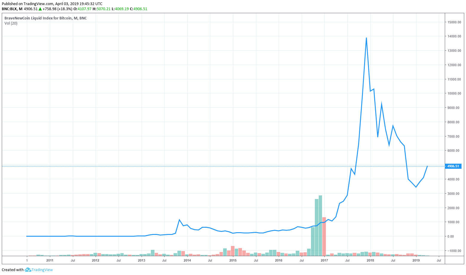
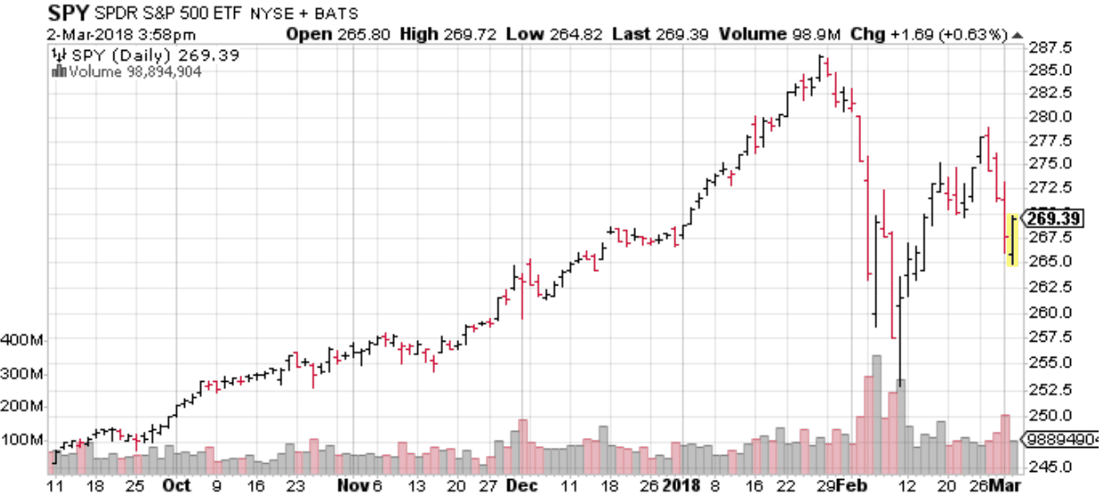
Bitcoin's 8-year chart (above) in logarithmic scale, which is explained later under charts, is an excellent illustration of relatively fleeting trends developing within trends which can be falsely perceived as a reversal of a long-term trend.
The price action over this 8-year period, including the 2018 bear spell, is construed as a secular bull trend, within which alternating roughly 2-year primary trends and cyclically corrective secondary trends have played out.
Due to their volatile nature, unregulated markets tend to break into numerous short-living secondary trends and frequent pumps and dumps, thus necessitating a more rigorous and cautious approach to trading.
A market top for a particular trend is the highest price point of the trend and market bottom is the lowest price point of the trend. Both of these points are difficult to pinpoint and usually only identified after the event.
However, analysts believe that a good indicator of market top is when investor sentiment is said to be euphoric, with broad consensus of further gains. Likewise, an extremely downcast, despondent investor sentiment across the market is said to augur a reversal of tide in the upward direction. Historically, when investor sentiment has been extremely negative, it's often proven to be a good time to buy.
Support and Resistance
Support and resistance levels, referred to as ‘battle lines' between bulls and bears, are perhaps the two concepts that best exemplify the self-fulfilling prophesy of technical analysis.
Support is the lower level of a trend at which the price is expected to bounce. Resistance is the upper level of a trend at which the price is expected to fall.
As all traders accept these levels as trend lines which demarcate the upper and lower limits of the current trading channel, when either of these trend lines is breached, a new trading channel is said to have been established and new battle lines are drawn.
Support and resistance levels are established by the price reaching, or ‘testing', a particular level without surpassing any further. The more often a level is tested without breaking further, the stronger the support or resistance.
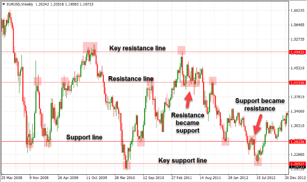
The image above shows the support and resistance levels for EURUSD pair over a 4 year period between 2008 and 2012. It's also an excellent illustration of secondary support and resistance levels developing within longer term primary channels.
When the price breaks down below a support level, this support level then becomes a new level of resistance. Likewise, when the price breaks out above a resistance level, the resistance now acts as a new support level.
Round numbers such as multiples of 10, 100, 1000 … and key statistical milestones such as a historical all-time high or an all-time low can also act as psychological support and resistance levels.
This is caused by buyers and sellers placing a huge number of orders at these milestone points. The concentration of buy and sell pressure at these levels often make them significant points of support or resistance.
In the event of a perceived breakout or breakdown, volume is an important factor in determining whether a support or resistance level has been truly breached. This is particularly true for breakouts above significant resistance levels. Without attendant volume, they usually tend to be a false breakout, known as a dead cat bounce, or a fleeting breakdown which cannot be sustained.
Another factor to consider is momentum, which is the rate of price shift. In markets with high liquidity, when shift in volume and shift in price are both significant, it is unwise to ‘fight the tape', which is an old expression for trading against the trend, alluding to the use of ticker tape to transmit the price of stocks.
Placing trades at exact support and resistance levels without adequate confirmation of a breakout or breakdown is not recommended.
A stop-loss order is an order to automatically exit a current position at a certain price if the market moves unfavourably. Seasoned traders usually place stop-loss orders, enabling them to capitalize on price breakouts if they are legitimate, whilst hedging against the risk of an unexpected turn.
Cryptocurrency Trading Part II: Charts Guide

Now that we've covered the basics of trading, it’s time to get down to the brass tacks of price charts, different types of charts and familiar chart patterns.
Put simply, a chart is a graphical representation of price variation as a sequence of points over time, with each point representing the closing price for a specific time interval – such as 1 hour, 4 hours, 1 day, 1 week etc…
Just as financial statements of a company are the primary source of insight for fundamental analysis, charts are the primary tools of the trade for technical analysts.
Traditionally, the Y-axis in a chart represents price, while the X-axis represents time.
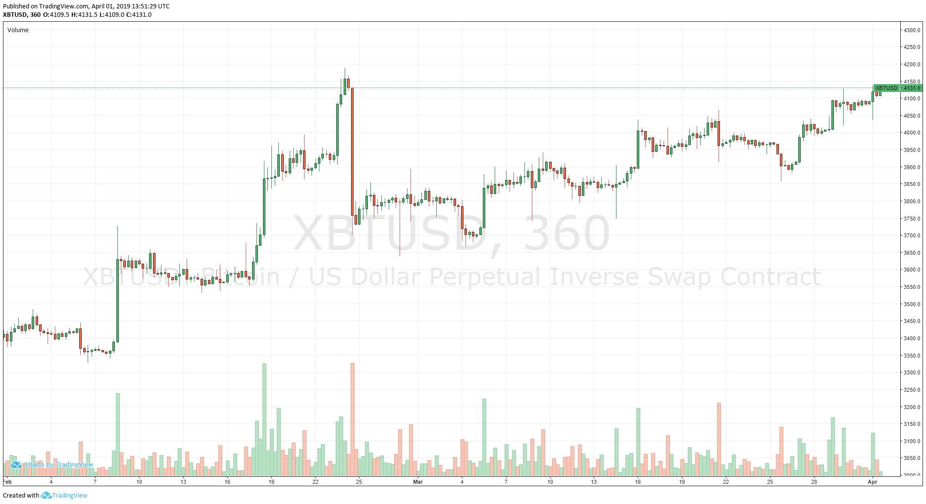
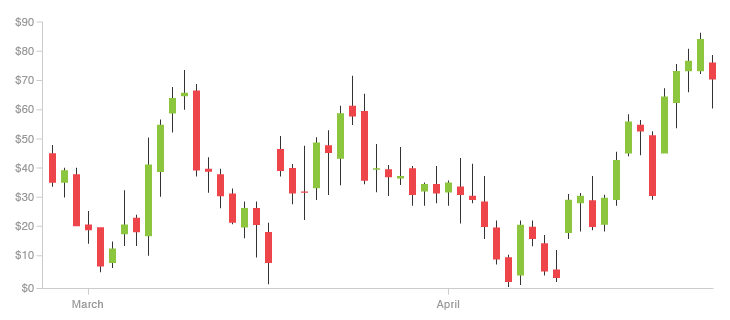
The chart in the image below is a candlestick chart for Bitmex XBTUSD perpetual contract for the 2-month period from the 1st of February to the 1st of April, with each candlestick representing a 6-hour period.
The time scale of a chart is the time period represented by each point in the chart. This can be intraday, daily, weekly, monthly or yearly.
The price scale, represented on the right side of the chart above, is the price interval between two price points – which in this case is 50. Price scale can be either linear, such as in the chart above, or logarithmic.
While the difference between two adjacent price points is constant in a linear scale chart, the price points on a logarithmic scale chart are logarithms of a base number greater than 1, which is usually 10.
To explain this in simpler terms, on a linear scale chart the distance between any two points of the same numerical difference, regardless of value, is equal – the distance between 1 and 2 is equal to the distance between 4 and 5 or 8 and 9.
Whereas in the case of a logarithmic scale, the distance between price points is based on the ratio of two values – the distance between 1 and 2 is equal to the distance between 4 and 8 or 12 and 24.
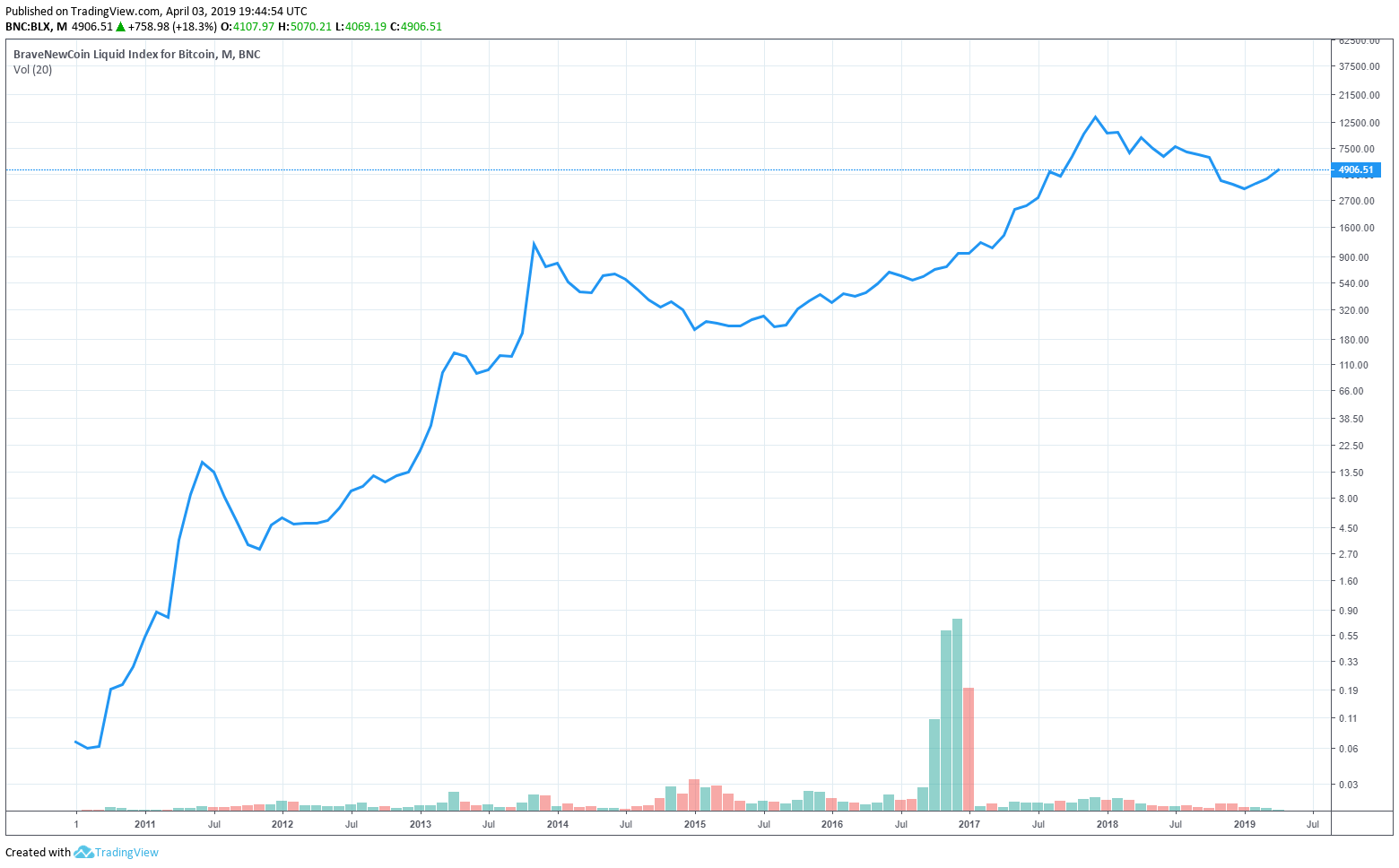
The two charts below are both all-time line charts for Bitcoin. The first chart is in linear scale and the second is a log scale chart.
Types of Charts
There are four different chart types, each offering different insights and often used in conjunction by traders depending on the type of information that is sought.
Line Chart
A line chart is the most simple and common chart type which is drawn by connecting the closing prices of every time interval.
Although line charts can be drawn for open, high and low prices, they usually represent the closing prices for each interval over a time period. While this is not the most intricate chart type, it's commonly used to spot trends due to the emphasis most traders place on closing price over open, high or low prices.
Bar Chart
A bar chart, also known as OHLC chart (open-high-low-close), is a more detailed representation of price action compared to a line chart, incorporating open, high, low and close prices using a series of vertical lines (bars) which are accented by a horizontal dash on each side.
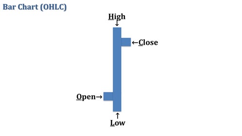
The vertical lines are called range lines, used to represent the range of price for each time interval (high and low), while the horizontal dashes to the left and right represent the open and close prices respectively.
As shown above, a black range line is used to denote a rising interval, in which the close price is higher than the open price, and a red range line denotes a falling interval, in which the close price is lower than the open price.
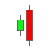
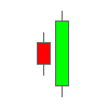
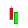
Japanese Candlestick Chart
Developed in the late 18th century by Japanese rice trader, Munehisa Homma, the Candlestick charting technique was introduced to the western world by Steve Nison in the early 1990s. In recent years, it has become the most popular chart type in the world.
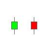
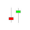
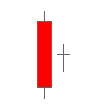
Candlestick charts use a hollow or filled body with upper and lower shadows to represent open, high, low and close prices. Further, the length of the body of a candlestick and its shape are used to represent the intensity of trading activity for a time interval.
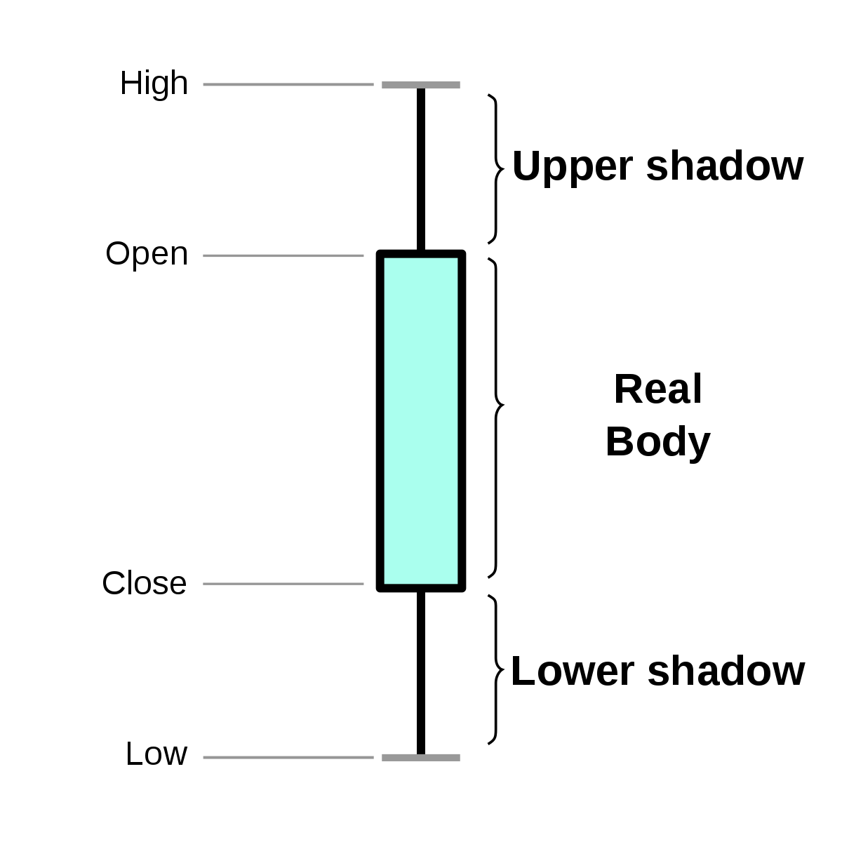
As shown above, a candlestick is composed of a body, representing open and close prices, and upper and lower shadows or wicks, representing high and low prices respectively.
Traditionally, if the close price for a time interval is higher than open price, the body is hollow or unfilled. If the close price is lower than the open price, the body is solid or filled.
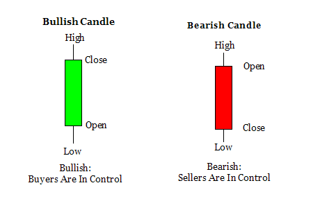
Modern candlestick charts commonly use green for higher closing (bullish candle) and red for lower closing (bearish candle).
Point and Figure Chart
Not the most well-known chart type among traders, it has nevertheless been used by technical traders in the west since the late 19th century.
A Point and Figure (P&F) chart reflects only price movements, using a column of X for rising prices and a column of O for falling prices, without regard for time or volume. If there is no significant price movement for a length of time, the chart will show no new data.
In P&F charts, the value that is represented by each X and O is determined as a set price interval. Any price change below this value is ignored. The chart shifts to a new column, called reversal, when the price changes in the opposite direction by the value represented by a certain number of Xs or Os.
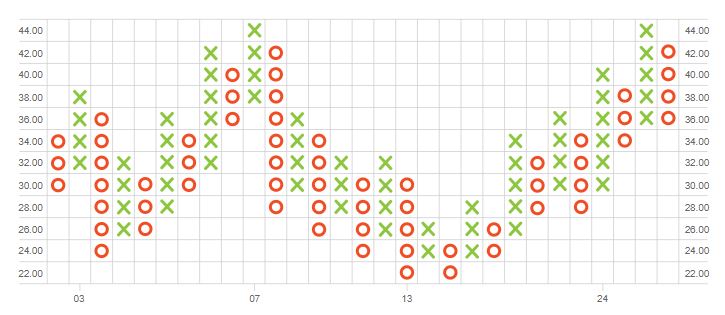
In the example shown above, each X or O represents a change by 2 dollars and reversal occurs if there is a change in the opposite direction by a value of at least 4 dollars. Although time can be represented in the X-axis, it is never reckoned as a factor in P&F charts.
This method of charting is used to eliminate the distraction or skewing effect that occurs in other chart types from accounting for time intervals with insignificant price movements.
Chart Patterns
Familiarizing with different, commonly encountered chart patterns can help traders break down the complexity of identifying trend lines. Chart patterns provide a cogent perspective into the intricate dynamics between supply and demand sides of a market.
Typically, chart patterns are classified into three categories based on their consequence – continuation, reversal and bilateral patterns.
Continuation patterns usually indicate a brief spell of consolidation, following which the prevailing trend is likely to continue in the same direction.
Reversal patterns portend a shift in the balance of supply and demand, often resulting in a trend reversal. These patterns can be typically sub-divided into top and bottom formations.
Bilateral patterns are triangle formations which indicate that the trend could sway either way, which, ostensibly, may not seem like the most helpful insight. However, these scenarios have historically proven to be very profitable when they are played right. We'll look into how bilateral patterns can be capitalized upon further in the piece.
It's important to remember that for any pattern to qualify as valid, prior trend information is critical. Depending on this information, the same pattern can be interpreted in different ways. Prior trend often dictates both the significance and the consequence of a pattern.
Cup with Handle
Cup with handle pattern can be either a continuation or reversal pattern depending on the prior trend.
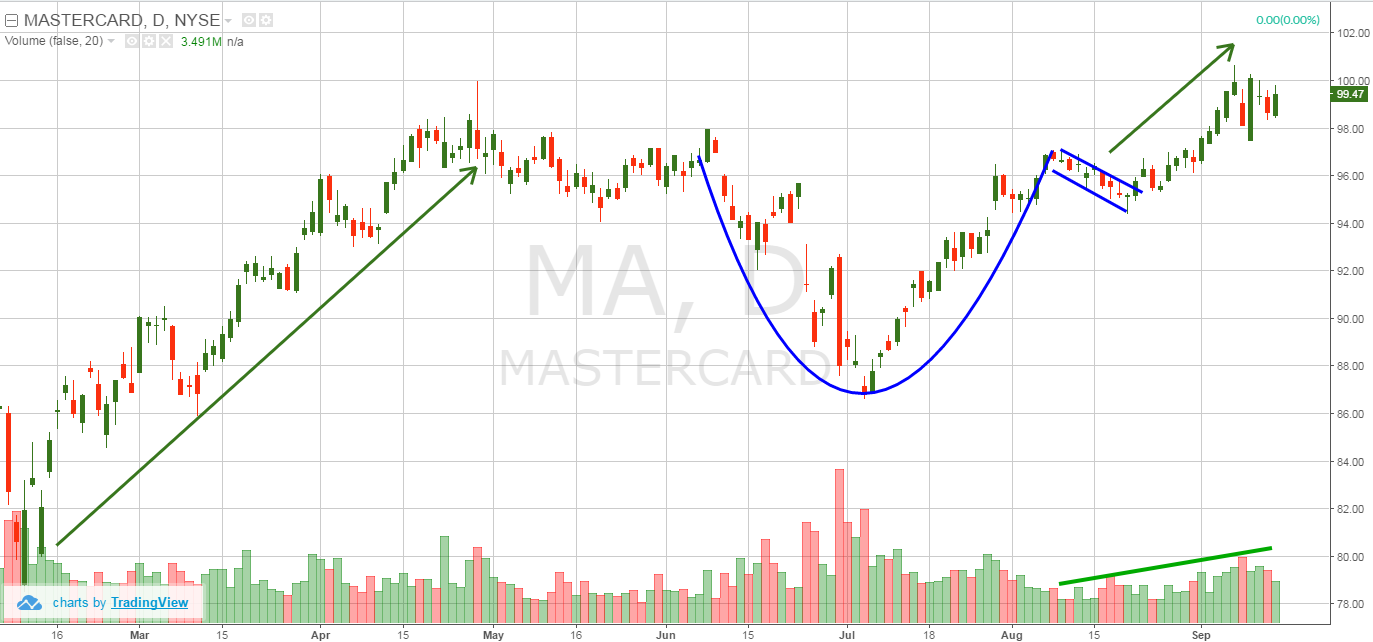
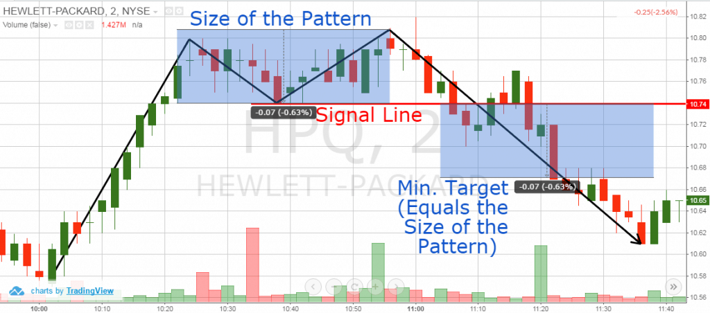
Cup with handle in an uptrend (as shown above) is a bullish continuation pattern, indicating that the prevailing upward trend will continue. The two components of this pattern are the cup and the handle formations as shown in the image. The cup should be bowl-shaped, more of a “U” and not a “V”. In an ideal scenario, the cup would have equal highs on either side before consolidating in a handle formation. Estimated price target for the next breakout following consolidation is symmetrical to the height of the cup.
When the same pattern develops in a prevailing downtrend (as in the chart below), it signifies the end of the downtrend and a breakout into an uptrend. Once the cup formation transitions to a handle formation, price must not decline beyond half the height of the cup. If price declines beyond half the cup's height, selling momentum is too significant and the formation is not valid.
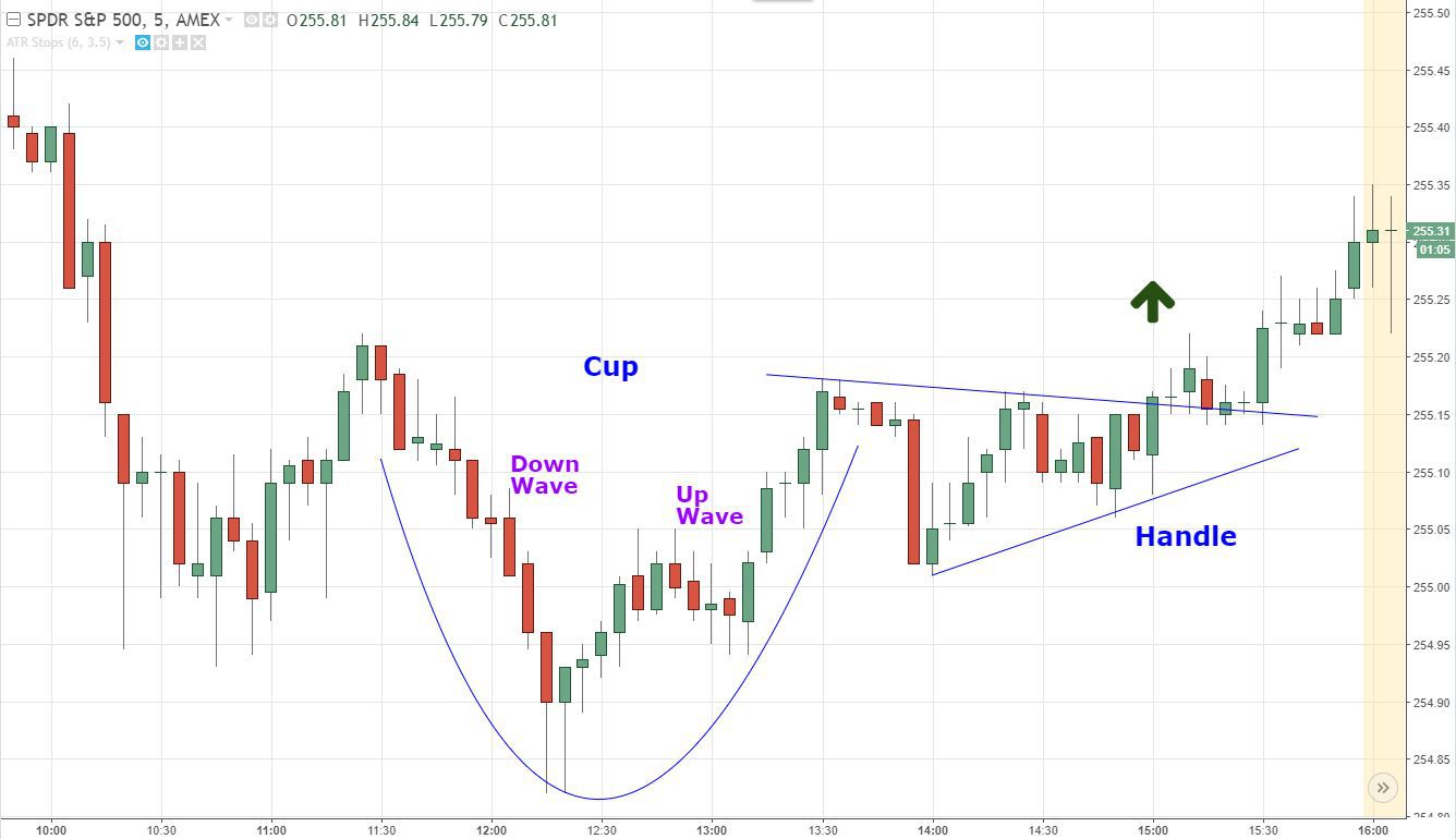
The longer it takes for the pattern to form and the deeper the cup formation, the greater the momentum behind the breakout and higher the price target. Adding the height of the cup to the breakout point provides a good indication of short-term price target.
In both of the above scenarios, place stop-loss order just below the low of the handle formation to hedge against an abortive rally.
Flags and Pennants
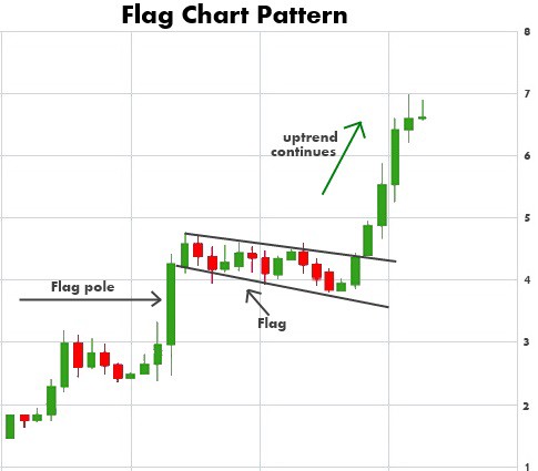
Flags and pennants are continuation patterns which are formed when a brief consolidation in price occurs before the market resumes moving in the same direction.
This brief consolidation phase is seen as a mid-point of a long-term trend and takes the form of a rectangle (flag) or a symmetrical triangle (pennant). While the flag formation is strictly sideways, the pennant is formed by a slight sloping move in the direction opposite to the prevailing trend.
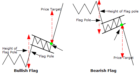
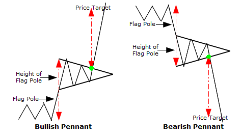
These patterns are usually preceded by a sharp rally or decline. The distance from the support or resistance level preceding the rally or decline to the top of the flag or pennant formation is called flag pole.
Trend lines are drawn along the highs and lows of the formation. When a flag or pennant formation occurs in a bullish trend, long entries should be placed just above the formation's high, whereas short entries should be placed just below the formations low in a bearish trend.
Price target is usually deduced by adding the length of the flag pole to the top of the formation in an uptrend and subtracting the length of the flag pole from the bottom of the formation in a downtrend.
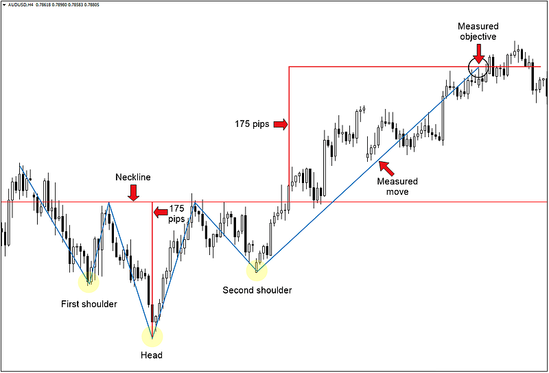
Head and Shoulders
Historically, Head and Shoulders (HS) has proven to be one of the most reliable reversal patterns.
Head and Shoulders Top
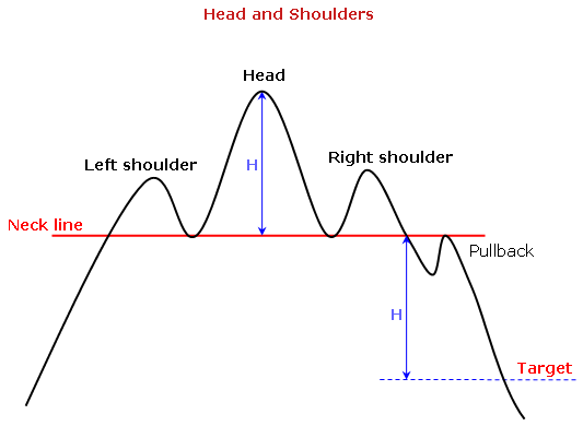
HS top is a bearish reversal pattern in a prevailing uptrend that consists of three parts – two smaller peaks or lower highs on either side of a taller peak or higher high.
Connecting the low of the left shoulder to the low of the head creates what is known as the ‘neckline'. Once the price falls below this line, the upward trend breaks down and the market enters a bearish trend.
Target estimation for the decline depends on the ratio of the higher high to the breakout point along the neckline. For example, if the higher high is 40 and the breakout point is 20, a 50% decline, then the estimated target for the breakdown below the neckline would be 10, a further 50% from the neckline.
When entering into short positions, place the order just below the trend line and use a stop loss just above the high of the right shoulder.
Head and Shoulders Bottom
HS bottom (also known as Inverse HS) is a bullish reversal pattern when the prevailing trend is downward. Similar to HS Top, it consists of three parts – two shallower valleys or higher lows either side of a deeper valley or lower low.
A trend line connecting the high of the left shoulder to the high of the head forms the angle of the neckline. When the price breaks above the neckline, a breakout occurs and the market enters an uptrend.
Price target is deduced by either adding the height of the head to the breakout point or projected similar to the HS Top formation based on the ratio between the lower low and the neckline. For example, if the lower low is 20 and the breakout occurs at 30 (2:3 ratio), then the target is estimated to be 45.
When taking long positions, enter once the price breaks above the trend line and place a stop loss just below the low of the right shoulder.
Double Top
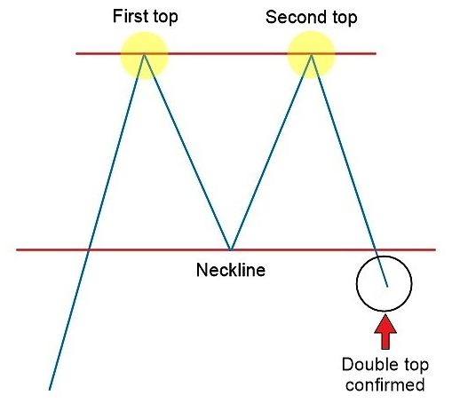
A double top is a bearish reversal pattern in a prevailing uptrend which is characterized by a brief pullback followed by abortive rally and a second pullback at the previous high which usually results in the price breaking down below the earlier low.
It's recommended to wait until the price drops below the first pullback low after retesting the top as the formation is only complete when this occurs.
Price target is calculated by either subtracting the height of the formation from the point where support breaks or based on the ratio between the formation's top and pullback low. If the formation's top is 20 and pullback low is 10(2:1), then price target for the breakdown is pegged at 5.
When taking short positions in this formation, enter once the price breaks down below pullback low and place stop loss at the most recent rally high.
Double Bottom
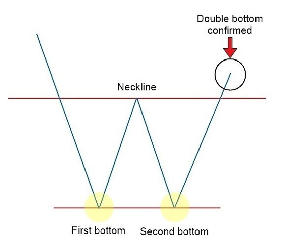
A double bottom formation is a bullish reversal pattern in a prevailing downtrend which is the mirror opposite of a double top.
This pattern forms when the price rallies to register a local high following a downtrend, falls again to the level of the previous low, before rallying again to break out above previous high, reversing into an upward trend. The formation is only complete when the price breaks out above the first rally high.
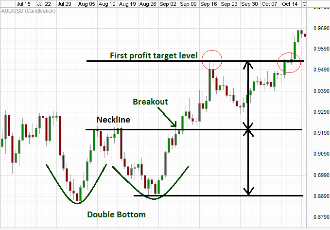
Price target for the breakout is deduced by either adding the height of the formation to the breakout point or based on the ratio between the formation's bottom and first rally high. If the bottom of the formation is 5 and the first rally reaches 10, then price target would be 20.
When taking long positions, set entry just above the first rally high and place stop loss at the most recent pullback low.
Triple Top & Triple Bottom
Both double top and double bottom patterns may sometimes extend further to form longer-term triple top and triple bottom formations, which are also reversal patterns.
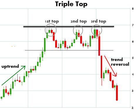
Triple top formation features three roughly equal peaks split by two valleys, whereas the triple bottom formation consists of three identical valleys split by two abortive peaks. Trend lines connecting the highs and lows within the pattern form support and resistance levels.
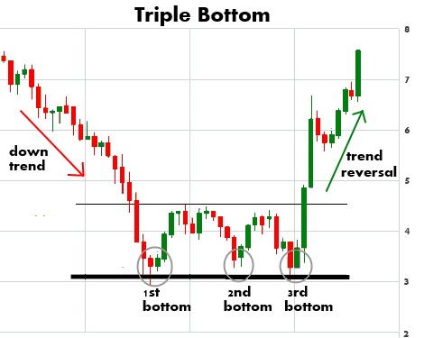
These patterns are traded similar to the double top and double bottom patterns. Price target is calculated by adding or subtracting the height of the formation to or from the breakout point.
Rounding Bottom
The rounding bottom, also known as saucer bottom, is a bullish reversal or continuation pattern characterized by a steeper cup or bowl formation than the cup with handle pattern and bears quite a few similarities to the Inverse Head and Shoulders pattern, only without discernible shoulders. The lows within the pattern can be connected to form a shape resembling the bottom of a saucer.
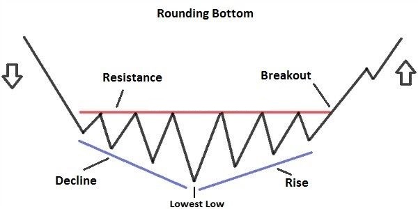
The formation begins with concerted selling pressure, which eventually loses steam and transitions into an uptrend with buyers seizing control of the market. When this pattern forms as a reversal in a prevailing downtrend, it portends a significant long-term uptrend.
The pattern is only complete when the price breaks out above the starting point of the initial decline within the pattern. Place long entries once the pattern completes and use stop loss at the most recent swing low or at the bottom of the cup.

To deduce short-term price target for this pattern, add the height of the cup to the resistance line.
Wedges
There are two types of wedge patterns – the rising wedge and the falling wedge. Each can be interpreted as a continuation or reversal pattern depending on the prior trend preceding the formation.
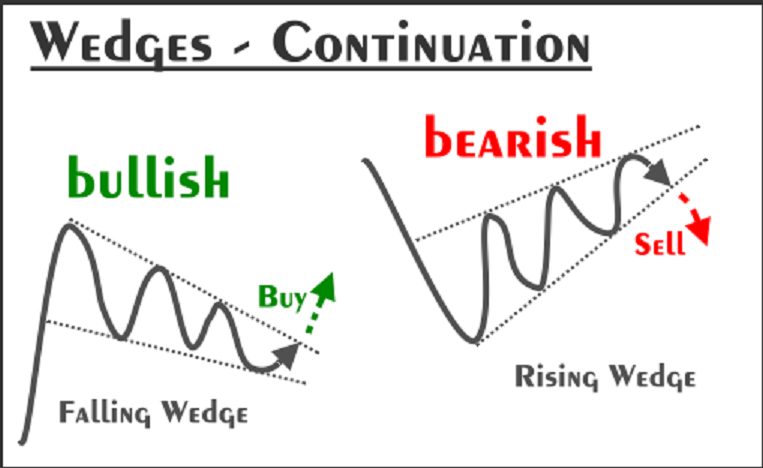
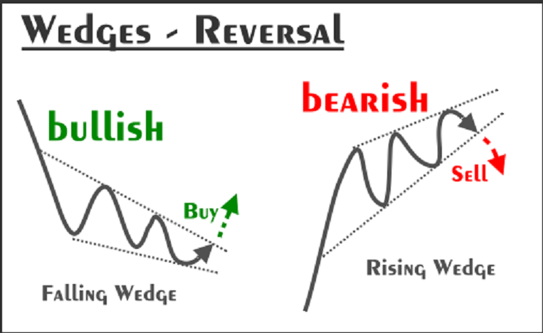
The rising wedge is regarded as a bearish pattern. The formation consists of an upward sloping, converging channel of support and resistance lines which forms a cone, where the lower support line is steeper than the resistance line. The steeper slope of the support line is due to more frequent higher lows than higher highs, resulting in congestion between the lines and eventual breakdown.
Rising wedge pattern in an uptrend signals a bearish reversal, whereas in a downtrend, it is seen as indicative of a continuation of declining prices.
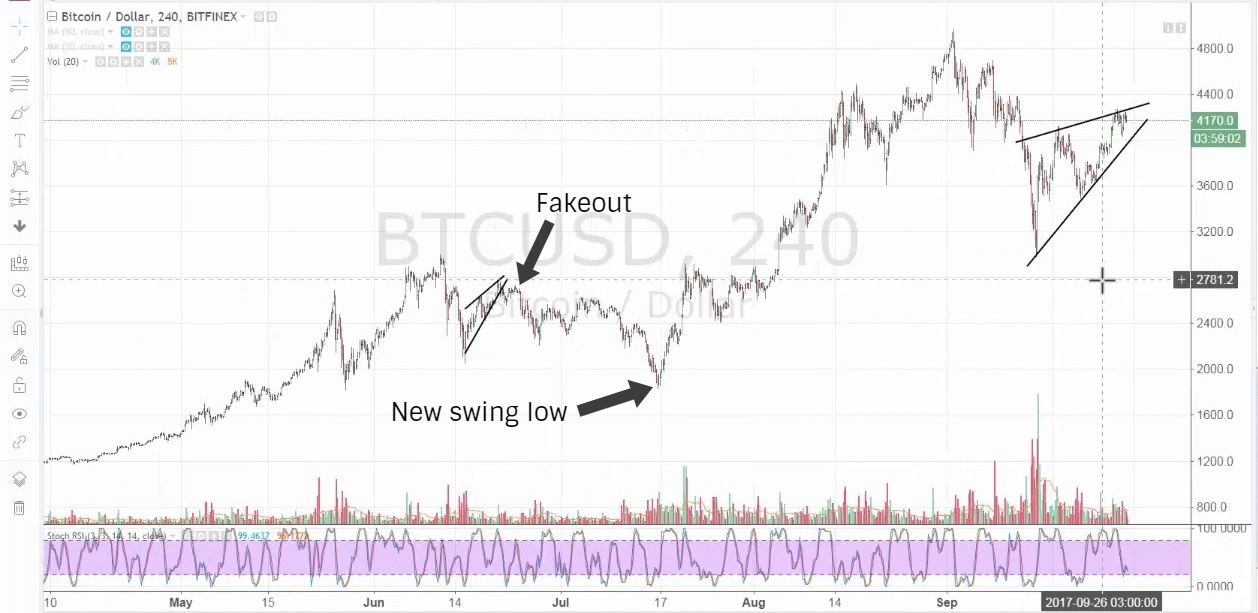
When entering into a short position, it is prudent to wait for confirmation of the support line being broken in a convincing manner. There can sometimes be a brief reaction rally (as shown in the Bitcoin chart above) immediately following a breakdown to test the support line as the new resistance.
The falling wedge is the mirror opposite of the rising wedge and is considered a bullish pattern. It is formed by a downward sloping, converging channel of support and resistance lines. The slope of the upper resistance line is steeper than the support line.
The falling wedge pattern indicates bullish reversal when it forms in a prevailing downtrend and a continuation of increasing prices when it forms in a prevailing uptrend. Bitcoin was in a falling wedge pattern prior to the recent upturn in price, as shown below, before breaking out to rally convincingly during the first week of April.
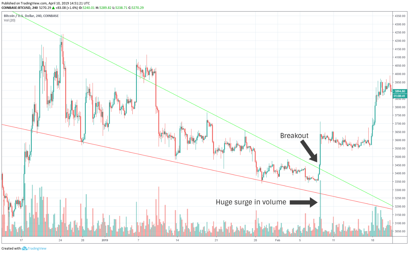
Before entering into a long position, wait for confirmation of the resistance line being breached convincingly backed by significant rise in volume. Volume is a key factor for confirming falling wedge breakouts.
Rectangles
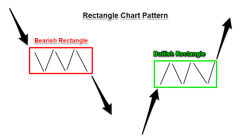
The rectangle, also known as trading range or consolidation zone, is a continuation pattern characterized by the price ranging between parallel support and resistance lines. During this impasse, the price will test support and resistance levels within the range several times before breaking out and continuing the prior trend, whether that is upward or downward.
In a prevailing bearish trend, the price will break down below the lower support level of the trading range after consolidation. In a bullish trend, the price will eventually rally above the upper resistance line to continue the upward trend. The pattern is only complete when this breakdown or breakout has taken place.
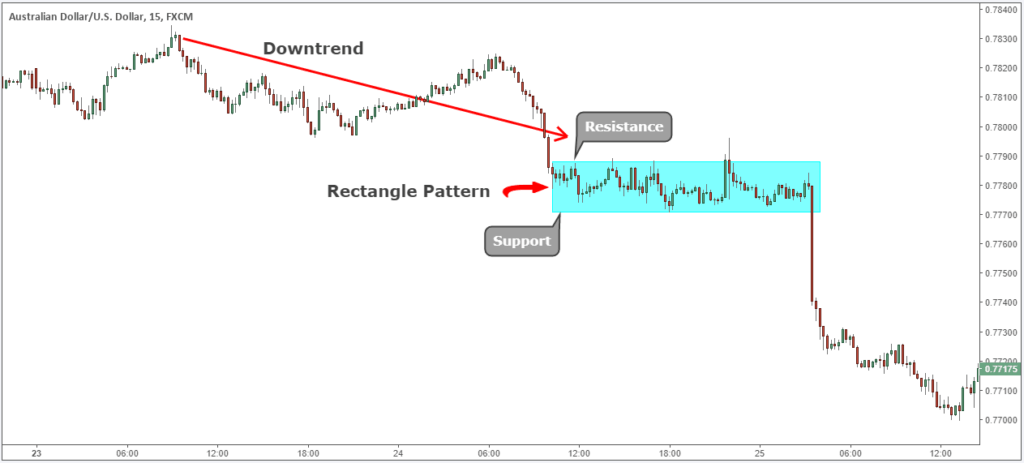
When placing a long trade in a bullish rectangle pattern, wait for confirmation of breakout above the resistance line and use stop loss at the most recent low within the pattern. In a bearish rectangle pattern, enter into a short once the price breaks down below the support line and place a stop at the most recent high.
Price target is symmetrical to the height of the rectangle formation and is derived by adding this height to the point of breakout or breakdown.
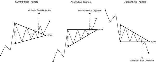
Bilateral Patterns (Triangles)
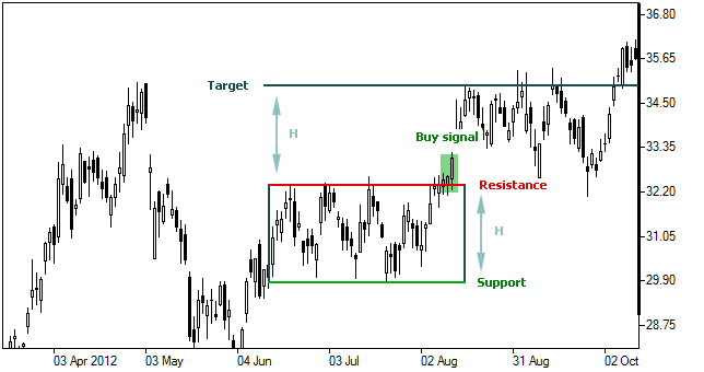
Ascending Triangle
The ascending triangle is generally a bullish continuation pattern in a prevailing uptrend. However, it can also form as a reversal pattern in a downtrend. As a bilateral pattern, an ascending triangle can occasionally break downward. It would be wise to wait for a convincing break of support or resistance before making a play.
The formation consists of two or more roughly equal highs and increasing lows. While the resistance line is horizontal, the extended support line slopes upward and converges with the resistance line to form a shape resembling a right-angle triangle.
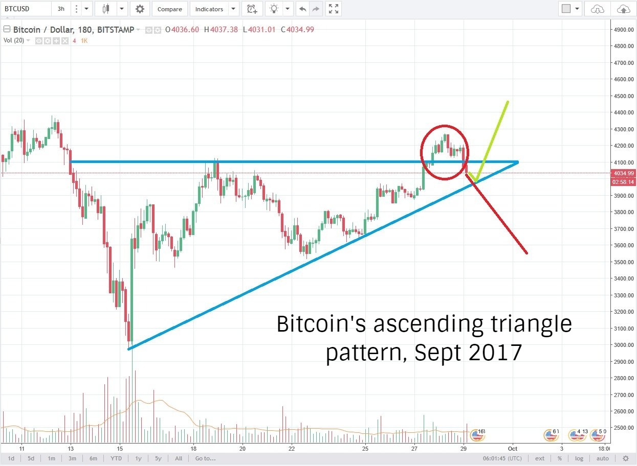
For the pattern to be valid, each successive swing or reaction low must be higher than the previous low. Volume begins to dwindle as the pattern takes shape. The pattern is usually considered complete when the price breaks out past the upper resistance line backed by a significant surge in volume. Once the resistance level is broken, the price may return to test this new-found support level.
Price target can be calculated by adding the height of the triangle's base to the breakout point. Stop loss should be placed at the most recent swing low.
Descending Triangle
The mirror opposite of the ascending triangle, the descending triangle is typically a bearish continuation pattern in a downtrend but can also sometimes form as a reversal pattern in an uptrend. Just like an ascending triangle, it may occasionally break out upward so it’s important to play the pattern as it develops and use tight stops.
In a descending triangle, equal lows form a horizontal support line and decreasing highs form a downward sloping resistance line. Both lines are extended to complete a right-angle triangle.
As in the case of an ascending triangle, successive reaction highs must be lower than the previous high within the formation for the pattern to be valid. Breakout is confirmed when the support line is breached accompanied by an increase in volume, although volume confirmation is not as important as in the case of an ascending triangle.
Price target is deduced by subtracting the height of the base of the triangle to the point where support breaks down. Place stop loss at the most recent swing high.
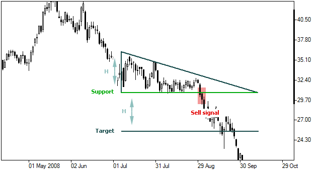
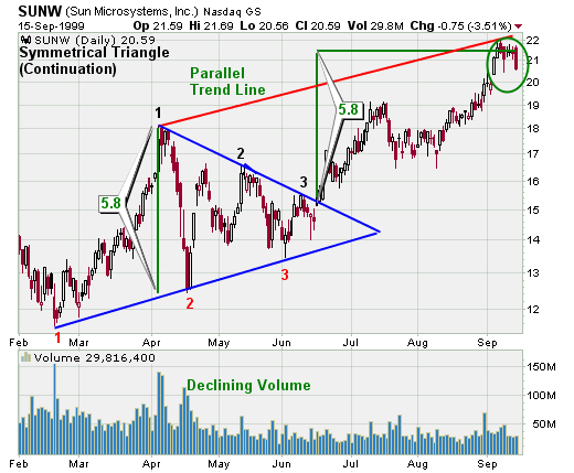
Symmetrical Triangle
Of the three triangle patterns, the symmetrical triangle is the quintessential bilateral pattern. Regardless of prior trend, there is no telling the eventuality of this pattern until a clear breakout is confirmed.
Often seen as a consolidation pattern, a symmetrical triangle consists of a sequence of lower reaction highs and higher reaction lows, at least 2 each. The resistance line slopes downward and the support line slopes upward. When the lines are extended, they converge to form the apex of a symmetrical triangle with a line connecting the support and resistance line at the beginning of the pattern forming the base of the triangle.
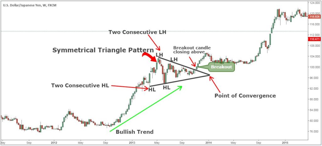
As the support and resistance lines converge, volume diminishes. A breakout is only confirmed when the support or resistance line is breached with attendant surge in volume, especially for an upward breakout. After price breaks through, the apex of the triangle can often turn into support or resistance level for future.
Since the direction of the breakout is difficult to determine, seasoned traders play this pattern by placing two orders, one long and one short, and closing the other when one of them hits.
Price target can be estimated by adding or subtracting the height of the base of the triangle to the breakout point. For long-term price estimation, an extended trend line can be drawn parallel to the support line (if the pattern breaks upward) or resistance line (if the pattern breaks down) passing through the other vertex of the triangle’s base. Stop loss is placed at the most recent swing low if price breaks upward or the most recent swing high if price breaks downward.
Top Five Profitable Patterns
With a plethora patterns to digest and reckon for when perusing charts, you're understandably feeling a little overwhelmed and probably wondering how to condense all this information to structure an effective trading strategy.
Perhaps knowing which patterns have proven to be most profitable historically could help you seek out the best patterns to trade on. Here are the top five patterns to look out for,
1 – Triangles (ascending, descending & symmetrical triangles)
2 – Head and Shoulders
3 – Double/Triple top and bottom
4 – Cup with Handle
5 – Flags and Pennants
Crypto Trading Part III: Technical Indicators and Overlays

We've learned how to identify and interpret chart patterns which means we're all set to start trading, right? Not so fast. For long-term trading, chart patterns may be sometimes sufficient but remember we talked about trading not being exact science? With that being the case, smart traders will always seek as many confirmations as they can derive from the data that is available. Besides, even for long-term trading, technical indicators can be used to determine the most favourable entry and exit points.
If chart patterns portray the supply and demand dynamics of the market in geometric form, technical indicators present an arithmetic assay of price action. Each indicator is essentially a formula used to arrive at a sequence of data points which can be used to infer market characteristics such as trend, volume, volatility and momentum.
Any single technical indicator on its own is not particularly telling without context, which is provided by information such as prevailing trend, chart pattern and other indicators. An indicator can be understood as a piece of a jigsaw puzzle, which when pieced together with other complementary indicators can paint a coherent picture of the market.
Indicators can be overlays or oscillators and each can be further classified as either a leading or lagging indicator. Overlays are indicators which use the same scale as the price and are plotted on top of the price chart, whereas oscillators are displayed independently on a different scale below the price chart and typically oscillate between a minimum and maximum value.
A leading indicator is one that has strong predictive qualities and can often indicate the direction of the market before the price follows through. Leading indicators can be very effective in portending imminent change in trend or momentum before it occurs. Popular leading indicators are Relative Strength Index (RSI), Stochastic Oscillator and On Balance Volume (OBV)
A lagging indicator is less predictive, follows the market trend and is delayed in its indication of a shift in the tides. Lagging indicators are useful in trending markets and as a confirmation of leading indicators but offer little insight in a ranging market with no clear trend. Bollinger bands and moving averages are two of the most frequently used lagging indicators.
Technical Overlays
Moving Averages
Moving averages are trend overlays which can indicate short, medium and long-term trend by computing the average price over a period of time. Moving averages are used to eradicate a lot of the noise (inconsequential fluctuations) and refine the price chart to make trends easier to spot. There are two common ways of doing this – Simple and Exponential. Both are considered lagging indicators, the former more so than the latter.
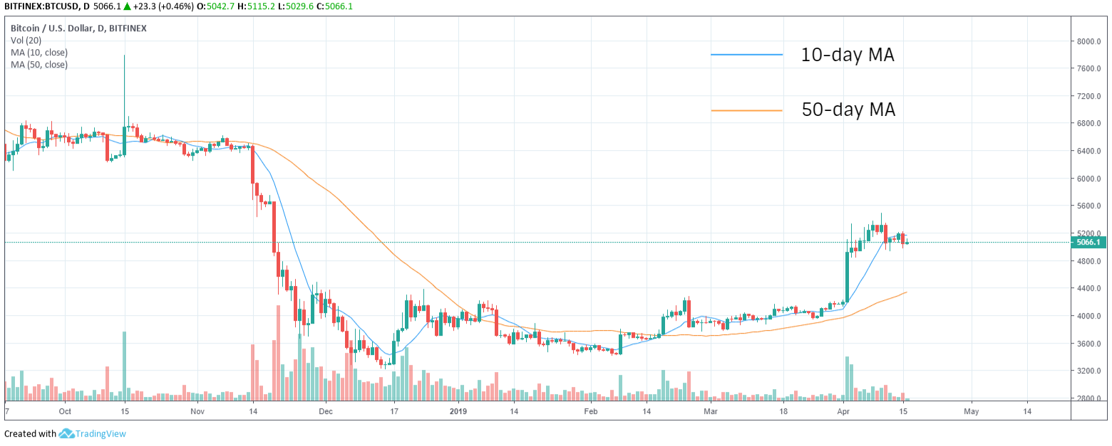
Simple Moving Average (SMA) is quite simply the sum of all the closing prices over a particular time period divided by the number of periods. For example, a 5-day SMA is calculated by adding the closing prices for each day and dividing the sum by five. The longer the time period, the greater the lag. Longer scales are used to smooth out price movements, and thus tend to be less responsive than shorter time scales. In the chart below, notice how the 50-day moving average lags behind the price while the 10-day moving average tightly hugs the price movements.
Exponential Moving Average (EMA) differs from SMA by placing greater weightage on the most recent data points, which makes EMA less tardy and a lot more responsive to price movements of recent periods than SMA.
A weighting multiplier is used to determine the weightage given to the most recent data point.
The formula used for calculating the multiplier is [2 / (Time period + 1)]
The weighting given to the most recent price for a 10-day EMA would be [2 / (10 + 1)] = 0.1818 (18.18%)
Current EMA = Today's price x weighting multiplier + Yesterday's EMA x (1 – weighting multiplier)
It's not important to memorize these formulae as modern chart tools automatically make these calculations but knowing how data points for an indicator are derived helps to better understand the significance of the indicator.
Simple and exponential moving averages are just different ways of analysing trends and one is not necessarily better than the other. Exponential moving averages respond faster to price movements, whereas simple moving averages are great for identifying long-term support and resistance levels. The slope of the simple moving averages are also used to gauge momentum of a trend.
Crossovers between two averages of different time scales are considered pivotal events indicative of a trend change. A bullish crossover (also known as a golden cross) occurs when the shorter scale moving average crosses above the longer scale moving average. When the shorter scale moving average crosses below the longer scale moving average, it's considered to be a bearish crossover (also known as a death cross).
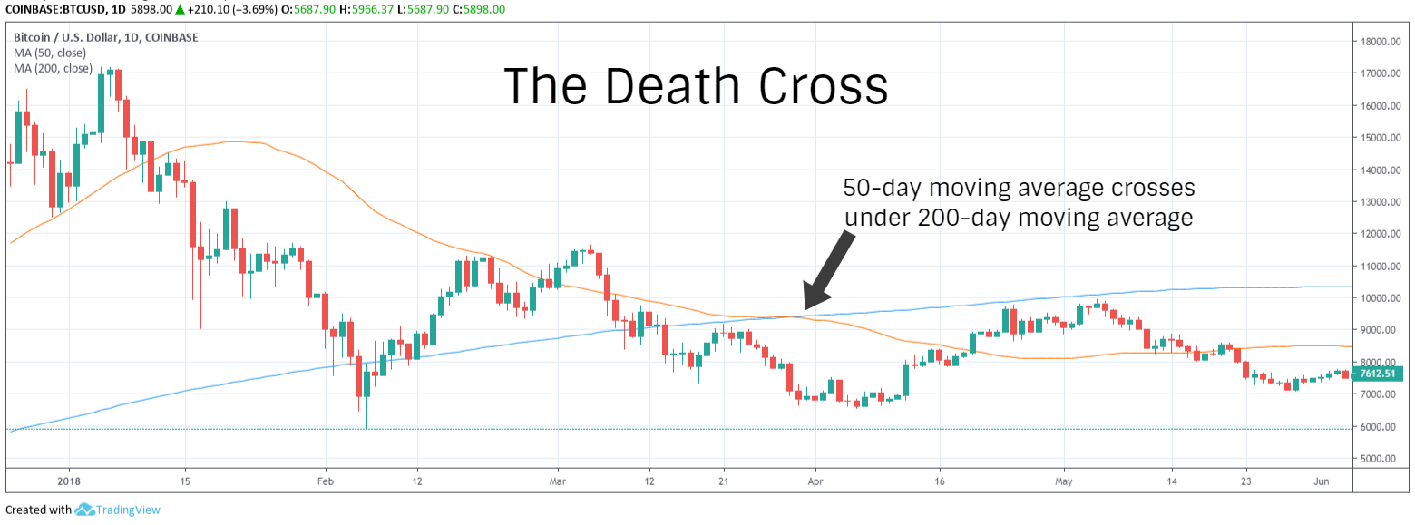
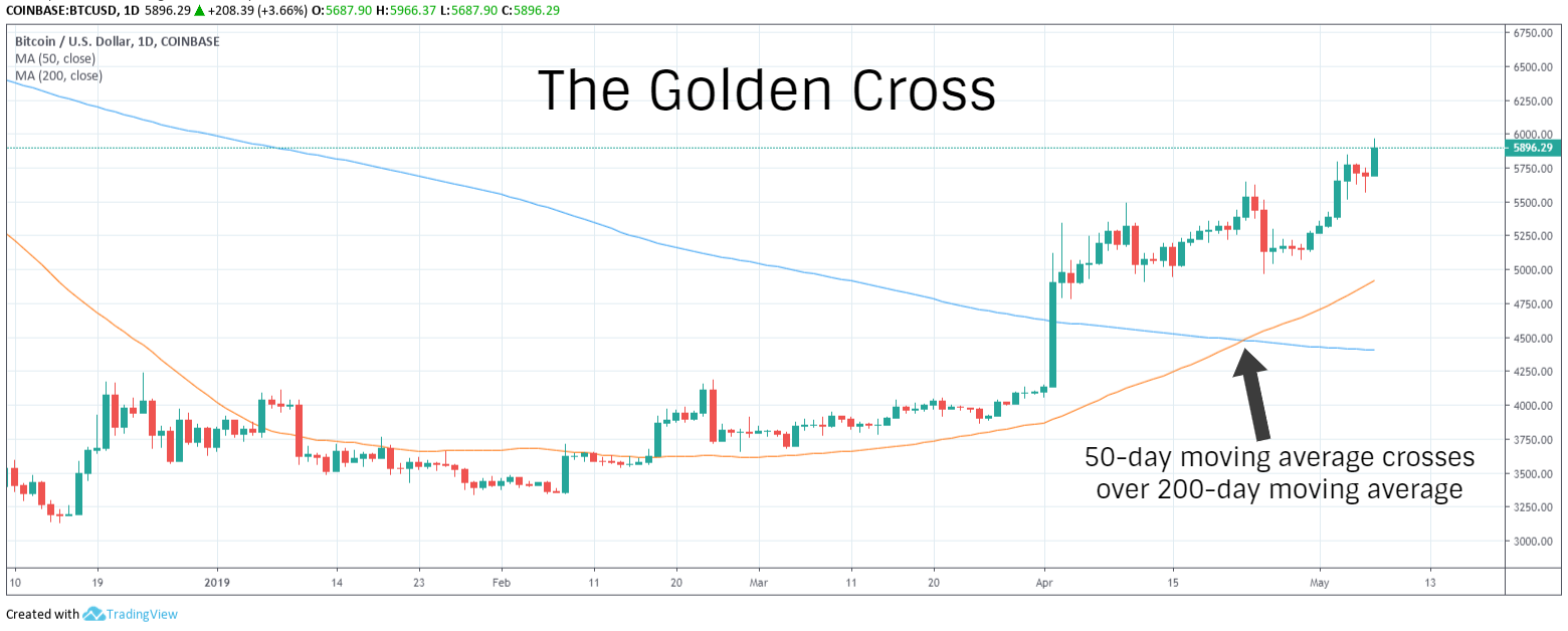
The 200-day SMA and 50-day SMA are the two most popular scales used to identify medium to long term trends, support, resistance and bullish or bearish crossovers and divergences. Further, the current price itself crossing above or below a long-term moving average is also seen as indicative of a bullish or bearish breakout.
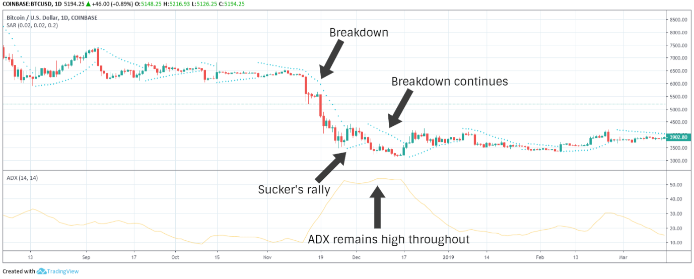
Parabolic SAR (Stop and Reverse)
Originally known as the Parabolic Time/Price System, Wilder invented Parabolic SAR as a tool to identify trend momentum and reversals.
An overlay lagging indicator, it is based on the idea that price tends to move in parabolic curves when it's trending. Thus, this indicator is most effective in trending markets. SAR tightly trails price movements over time, always below the price curve in an uptrend and above the price curve in a downtrend. Thus, traders use SAR to set trailing stops and protect their profits.
The formula used to calculate SAR is different for rising and falling SAR and is based on the data from one period behind,
For rising SAR,
Current SAR = Last period's SAR + AF (EP – Last period's SAR)
For falling SAR,
Current SAR = Last period's SAR – AF (EP – Last period's SAR)
Where EP is the extreme point, which is the highest high or the lowest low of the current trend and AF is the Acceleration Factor. Initially set to a value of 0.02, AF increases by 0.02 for each new high or low made by the extreme point.
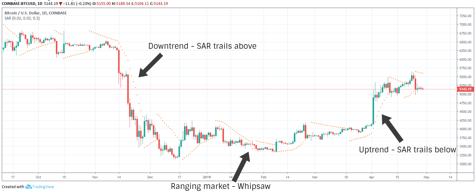
Increasing AF increases SAR sensitivity and tightness to the price curve. Lower AF moves SAR further away from the price and higher AF moves SAR closer to the price. Setting the value too high can result in too many whipsaws and lead to false reversal signals.
SAR is most effective when used in conjunction with another concept of Wilder's, the Average Directional Index, which is used to determine the strength of a trend. Let's find out how.
Bollinger Bands
Named after American financial analyst, John Bollinger, who developed it in the 1980s, bollinger bands is a moving average based overlay used to measure price volatility. It comprises three bands – a middle band which represents simple moving average, an upper band and a lower band, which represent standard deviations.
The middle band is typically the 20-day simple moving average (SMA). The upper band is 2 x 20-day standard deviation added to the 20-day SMA. The lower band is 2 x 20-day standard deviation subtracted from the 20-day SMA. The number of periods can be adjusted to trading preferences. However, the same number of periods used to calculate the SMA is also used for the standard deviation.
The width of the bands indicates volatility. Widening of the bands indicates increase in volatility and a trending market. Narrowing of the bands means that volatility is dwindling and the market is ranging.
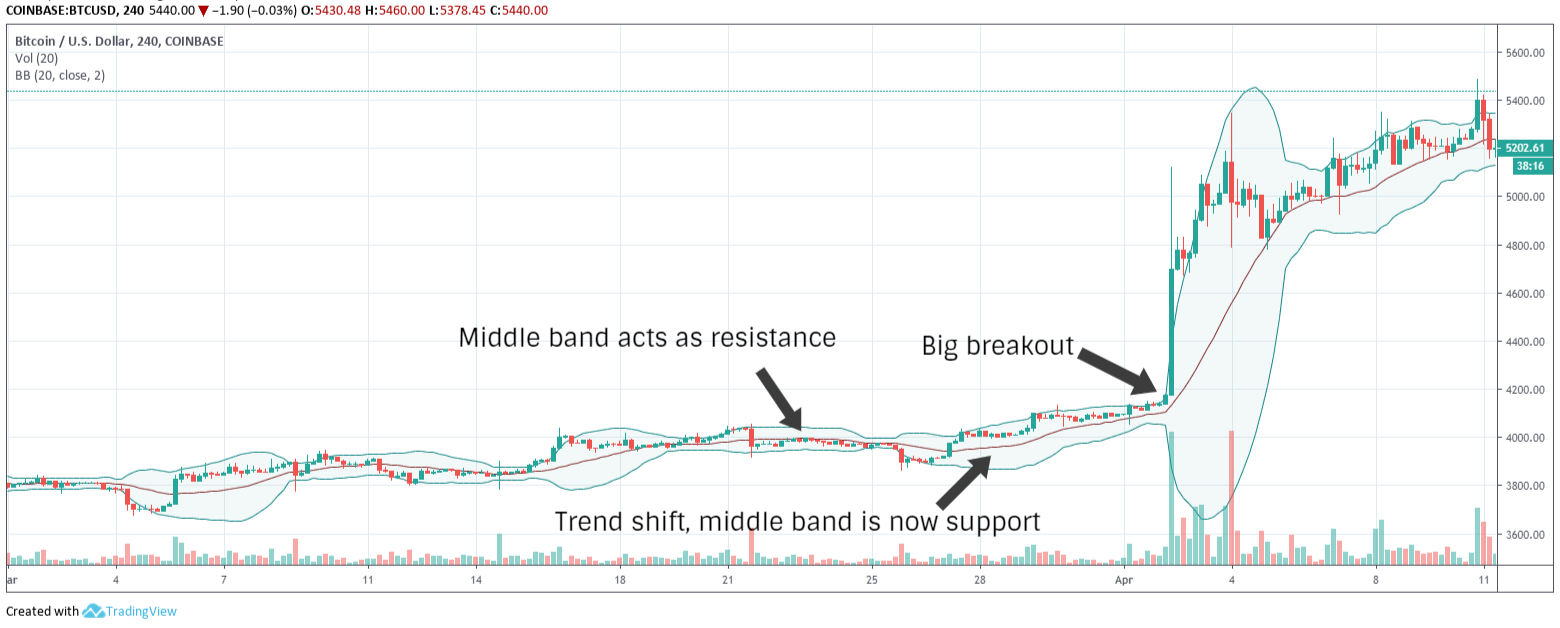
Around 90% of price movements occur within the bands. Therefore, price moving sharply out of the upper or lower band is often considered indicative of a breakout. During a strong uptrend, the price tends to hug or even frequently move out of the upper band and during a strong downtrend, the price activity is usually concentrated around the lower band. The middle band acts as resistance in a downtrend and support in an uptrend.
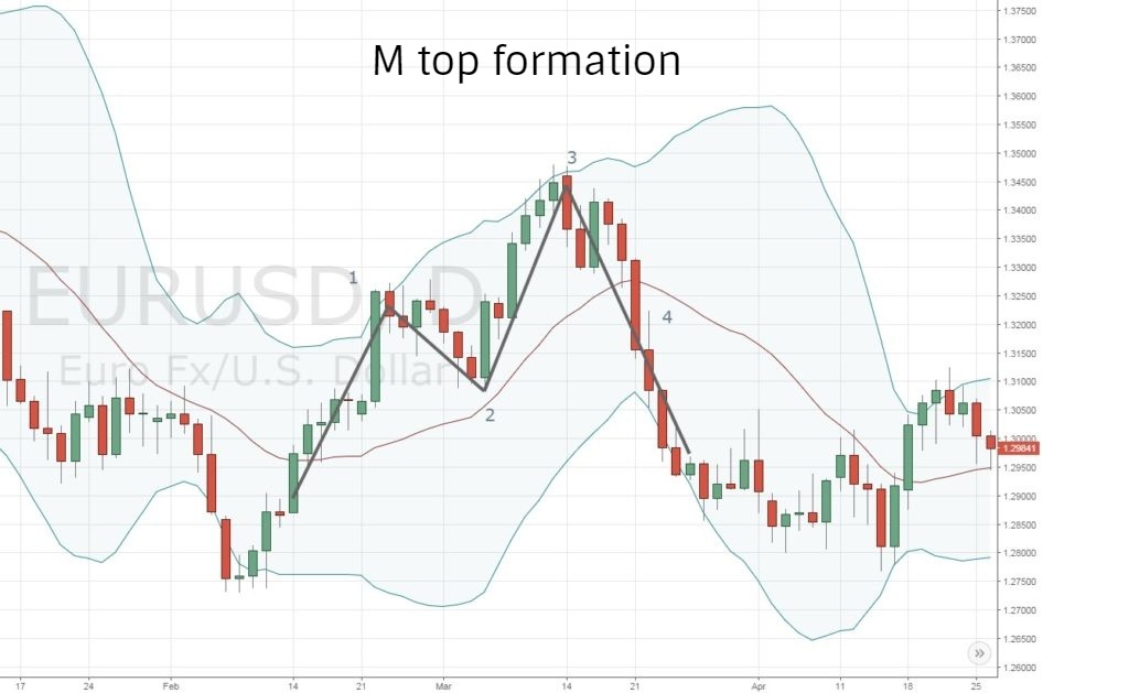
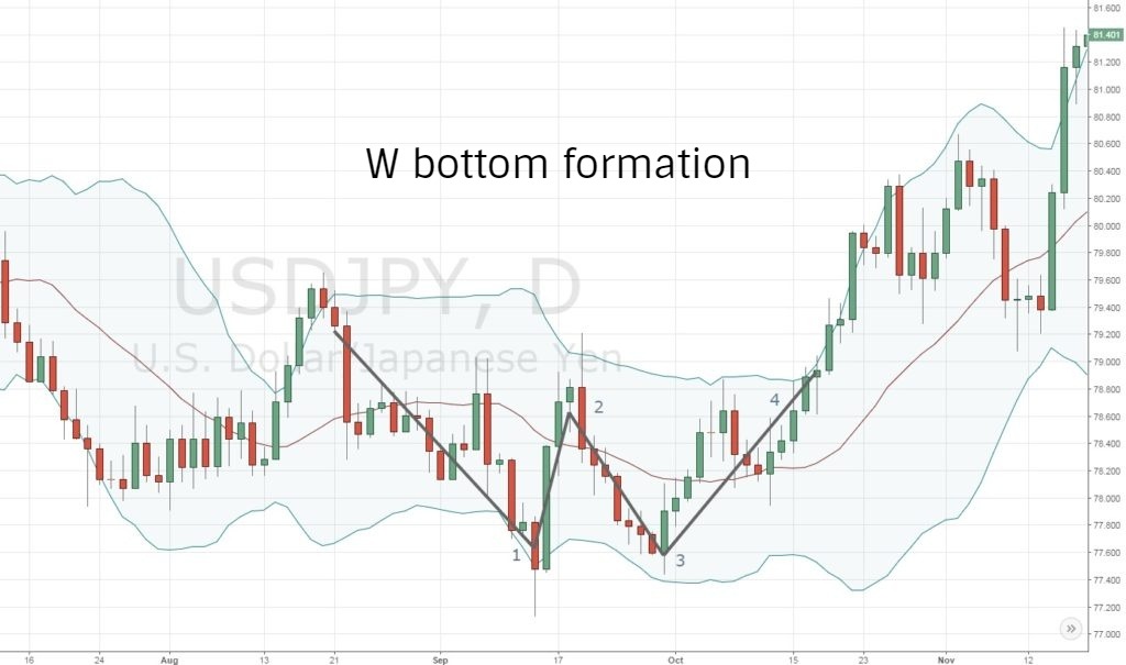
The two key patterns traders look for with bollinger bands are double top and double bottom, also referred to as M top and W bottom. Bollinger identifies multiple structural variations of these patterns.
The M top occurs in an uptrend and is indicative of a bearish reversal. In this formation, the price registers a high above the upper band, pulls back below the middle band, moves up again but stops short of the upper band. The second swing high failing to reach the upper band is a sign of weakening trend and portends a reversal.
The W bottom formation is the mirror opposite of an M top and signals a bullish reversal. The price first registers a swing low below the lower band, rallies past the middle band before making a second swing low but does not touch lower band and rallies past the earlier swing high to break out into a bullish reversal.
Technical Indicators
Moving Average Convergence-Divergence (MACD)
Invented in 1979 by Gerald Appel, Moving average convergence-divergence (MACD) is a trend-following oscillator which is widely regarded as the most effective momentum indicator. MACD juxtaposes two exponential moving averages, typically 12-day and 26-day EMA, plotted against the zero line to measure the momentum of a trend.
A derivative of MACD is MACD Histogram, developed in 1986 by Thomas Aspray. MACD Histogram measures momentum based on the relationship between MACD and its signal line (9-day EMA of MACD).
The modern MACD oscillator comprises four elements – MACD line, Zero line, Signal line and MACD Histogram
MACD line is the 26-day EMA subtracted from the 12-day EMA (12-day EMA – 26-day EMA)
Zero line is the point where the two EMAs are equal
Signal Line is the 9-day EMA of MACD
Positive MACD, when the 12-day EMA is above the 26-day EMA, indicates that the market is bullish. The higher the value, the stronger the upward momentum. Conversely, negative MACD indicates that the market is bearish, with lower values suggesting strong downward momentum.
MACD Histogram, plotted as bars along the zero line, is the difference between MACD line and the signal line (MACD line – Signal line).
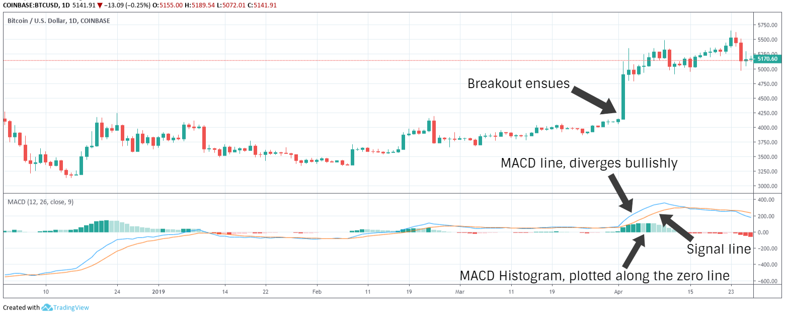
Convergence, crossover and divergence from the zero line and signal line are construed as pivotal events indicating relenting momentum, shifting of market forces and surging momentum respectively.
Please note that the scale for MACD and signal line are commonly used values. Traders may opt to change the scale to suit their own trading needs.
Relative Strength Index (RSI)
Mechanical engineer turned technical trader J. Welles Wilder sired multiple new technical indicators in his 1978 book, New Concepts in Technical Trading Systems. While other indicators such as Average True Range, Average Directional Index and Parabolic SAR have also stood the test of time, Relative Strength Index (RSI) remains arguably the most enduringly popular of Wilder's concepts.
RSI is a momentum oscillator and an excellent leading indicator used to identify strength of trends, as well as oversold or overbought market conditions.
The indicator oscillates between 0 and 100 and the typical timeframe recommended by Wilder is 14 days. An RSI value below 30 represents oversold conditions, whereas an RSI value above 70 indicates overbought conditions. Some traders use 20 and 80 instead of 30 and 70, which may be more effective for highly volatile markets. As a leading indicator, the slope of the RSI can often presage a trend change before it occurs.
RSI = 100 – (100/1+RS)
Where RS (Relative Strength) = Average Gain/Average Loss
Gains are periods where the price closes above the previous day's closing and losses are periods where the price closes below the previous day's closing. It should be noted that values are absolute, meaning that losses are reckoned as positive values.
The first calculation is made by simply adding gains and losses and dividing each by 14.
For subsequent gain and loss calculations, a modified average is calculated as follows,
- Average Gain = [(previous average gain) x 13 + gain for current period] / 14
- Average Loss = [(previous Average Loss) x 13 + loss for current period] / 14
RSI divergences can be handy trading signals but only within appropriate context – just another reminder to never use any single indicator as a signal without sufficient context.
A bullish divergence occurs when the price makes a lower low and RSI makes a higher low. A bearish divergence occurs when the price makes a higher high while RSI makes a lower high.
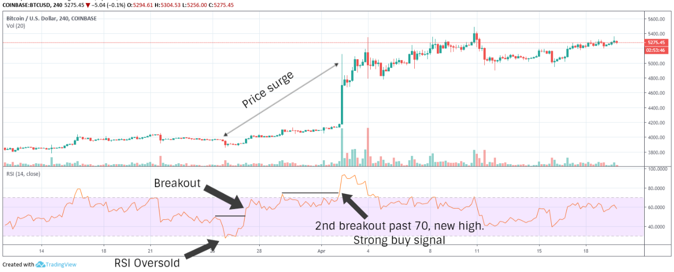
An RSI failure swing is seen as an indication of potential trend reversal. A bullish failure swing is when RSI falls below 30, bounces past 30, falls back but does not fall below 30 and makes a new high. Likewise, in a bearish failure swing, the RSI breaks above 70, falls back, bounces without breaking 70 and falls back to a new low.
Average Directional Index (ADX)
In recent years, ADX has risen in popularity to become a widely favoured indicator for estimating the strength of a trend. A lagging oscillator, ADX on its own offers little insight into the actual direction of a trend but only the magnitude of market forces behind a trend.
ADX oscillates between 0 and 100. According to Wilder, ADX is typically below 20 in a ranging market and above 25 in a trending market, with values above 40 indicating strong trends.
To calculate ADX, we need determine the positive and negative directional indicators, +DI and -DI respectively, together referred to as the Directional movement indicator. DMI is computed by collating the highs and lows of consecutive periods.
- +DI = (Smoothed +DM / ATR) x 100
- -DI = (Smoothed -DM / ATR) x 100
Where +DM = Current period's high – Previous period's high, -DM = Previous period's low – Current period's low and the smoothing technique used by Wilder involves taking the average of last 13 periods, adding the most recent value to it and dividing the sum by 14.
ATR is Average True Range, another concept developed by Wilder, which is a volatility indicator.
True Range (TR) is the absolute value of the greatest amongst three differences (current period's high – low, current period's high – previous period's close, current period's low – previous period's close).
- ATR = [TR of last 13 periods + current TR] / 14
- Directional Index (DX) = [(+DI – -DI) / (+DI + -DI)] x 100
- ADX = [DX of last 13 periods + current DX] / 14
The formulae may seem complex at first glance but as we've discussed before, it's not necessary to memorize any of the formulae by rote. The purpose of knowing how an indicator is calculated is only to better understand its significance and context for generating signals.
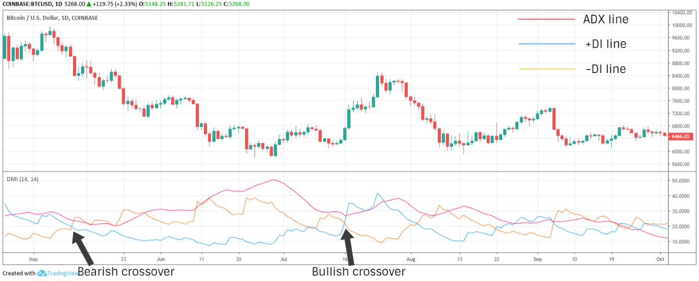
Although ATR offers no indication of trend direction, +DI and -DI do exactly that. Besides using ADX for determining the strength of a trend, traders also use crossovers of +DI and -DI to generate signals for potential reversals. For example, +DI line crossing above or diverging upward from -DI line with ADX above 40 is a strong bullish signal. However, crossovers and divergences while ADX is below 20 are not signals of much consequence. The chart below shows how to read ADX within the context of Parabolic SAR.
Fibonacci Retracement
Named thus for the use of Italian mathematician, Leonardo Bogollo's Fibonacci sequence, which starts with 0 and 1 with each successive number in the sequence being the sum of the two preceding numbers, Fibonacci retracement is a concept in technical trading used to identify the extent of corrective retracement after a rapid price advance or decline.
In the Fibonacci sequence, the ratio of any number to its successor is .618(61.8%). This is called the golden ratio or phi – where the ratio of the larger number to the smaller number is the same as the ratio of the sum of the numbers to the larger number. The golden ratio is ubiquitous in nature and has great historical significance in various fields of science.
Fibonacci retracement uses this ratio to identify support and resistance levels, known as alert zones. The five alert zones are 23.6%, 38.2%, 50%, 61.8% and 78.6%. The 50% alert zone is not based on the Fibonacci sequence but originates from Dow Theory, which postulates that corrections typically result in a 50% retracement from the previous move. The retracement levels are drawn on a price chart after marking the high and low point of a trend.
A 23.6% retracement is often seen in shorter timescales and a bounce from this level is less common if the correction has momentum. 38.2% and 61.8% retracements are more likely reversal zones, the latter known as the golden retracement.
Some traders also use a derivative of Fibonacci retracement, the Fibonacci extension, to identify how far a strong rally may reach. The sequence can be extended as 78.6%, 100%, 161.8%, 261.8%, 423.6%…
The Elliott wave principle is another closely related concept developed by American accountant, Ralph Elliott in 1938. After studying American markets for a decade in his retirement, Elliott asserted that prices invariably and perpetually move in a fractal wave pattern governed by natural laws which can be delineated using the Fibonacci sequence.
According to Elliott, prices move in two types of waves – impulse wave and corrective wave.
Impulse waves, also known as motive waves, move in the direction of prevailing trend and consist of five smaller waves, three trend advancing or actionary sub-waves split by two corrective sub-waves.
Corrective waves, which can be part of a larger impulse wave, move against the direction of prevailing trend and comprise three smaller waves, two corrective sub-waves split by one actionary sub-wave.
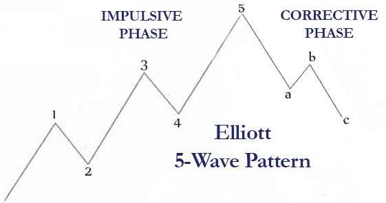
An impulse wave and a corrective wave together, consisting of 8 sub-waves referred to as the 5-3 structure, make up each Elliott wave cycle. The image below is a good illustration of Bitcoin's extended Elliott wave cycles, buttressed for most of 2018 by the 78.6% Fibonacci support level.
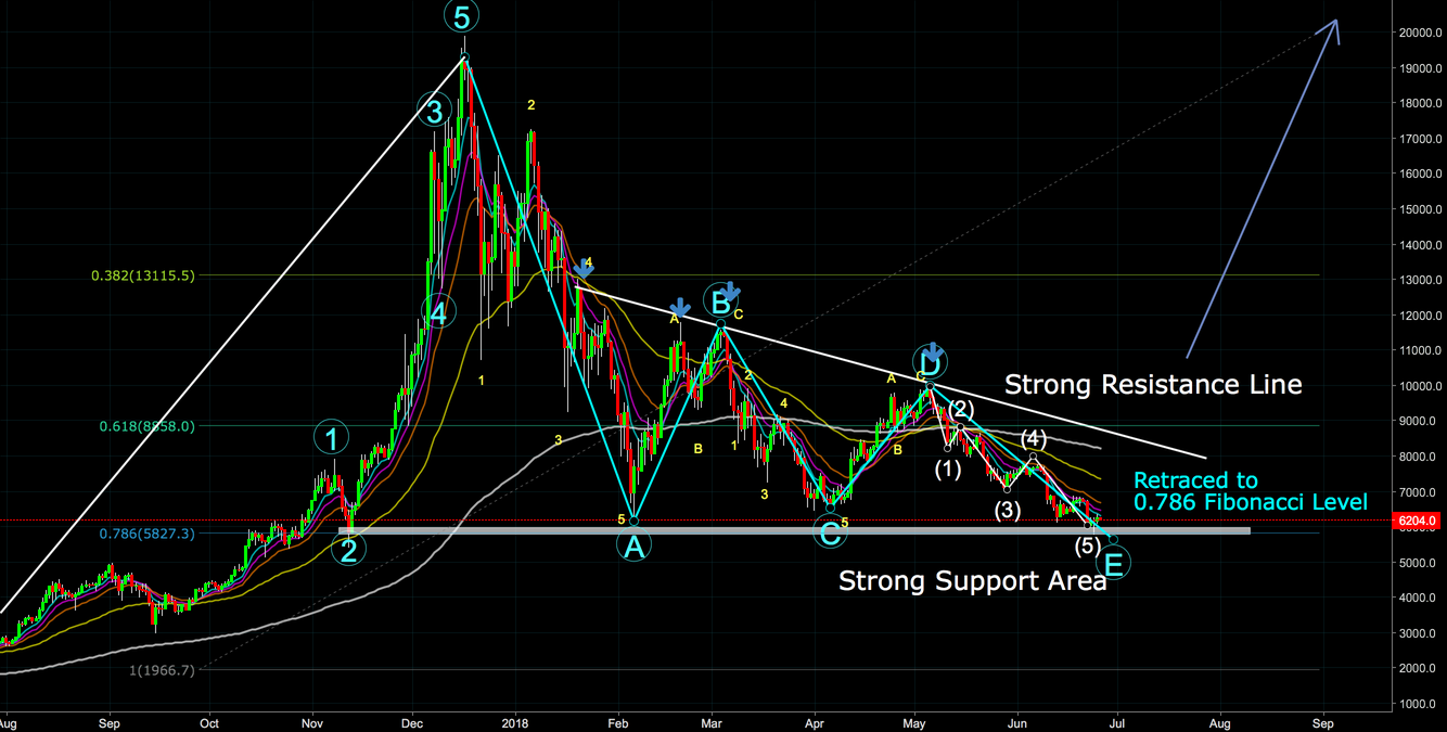
As with any other signal, Fibonacci retracement levels and Elliott wave patterns are only a part of the picture. When retracement reaches Fibonacci alert zones, it's time to take a look at other indicators and see if other signals corroborate reversal at these alert zones.
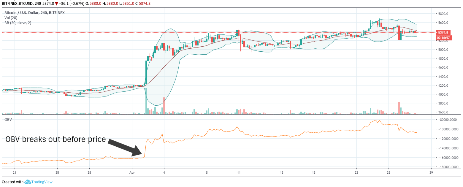
On Balance Volume (OBV)
A volume-based oscillator, detailed by Joe Granville in his 1963 book, Granville's New Key to Stock Market Profits, On Balance Volume (OBV) is a leading indicator which quantifies volume and uses cumulative volume for a period to measure the strength of trends in either direction.
Granville theorized that significant changes in volume often precede price movements and that volume tends to be higher on days when the price moves in the direction of the prevailing trend.
OBV simply adds volume on periods when the close is higher than the previous close and subtracts volume on periods when the close is lower.
The actual value of OBV is of little consequence. The rate of change, rise or fall, in OBV is what indicates the strength of buy/sell pressure. When OBV is rising, buy pressure is higher and could lead to higher prices, whereas falling OBV could mean a price decline is imminent.
Traders use the OBV oscillator to identify support and resistance levels and look for breakouts which often precede price breakouts. OBV diverging from the prevailing trend could signal a possible bullish or bearish reversal.
If price makes a higher swing high and OBV makes a lower swing high, it is a sign of weakening uptrend. Similarly, when price makes a lower low and OBV makes a higher low, the downtrend is losing steam and a bullish breakout could be right around the corner.
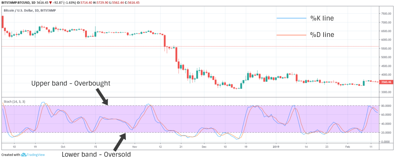
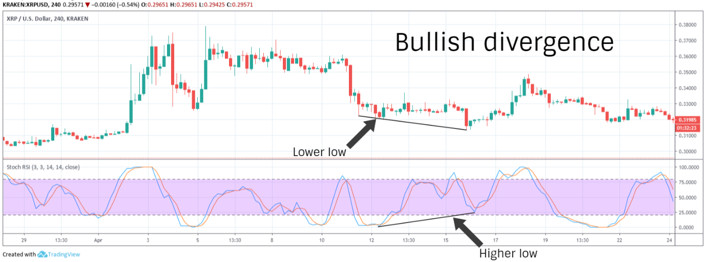
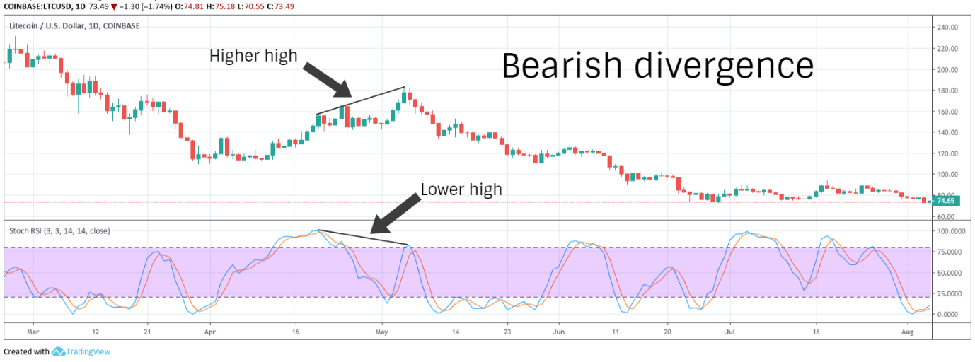
Stochastic Oscillator
Granville's student and prominent technical educator, George Lane, developed the stochastic oscillator, a leading oscillator which measures momentum, in the late 1950s. Lane based the indicator on the idea that momentum always shifts before price and variations in momentum can often previse a change in market direction.
By measuring the relationship between the closing prices over a given period and the trading range (high and low) of the period, stochastic oscillator is primarily used to identify potential trend reversals, overbought and oversold conditions. The indicator oscillates between 0 and 100, which are the bottom and top of the trading range over a given time scale, typically set to 14 periods.
The oscillator comprises two lines, the slow oscillator or %K and the fast oscillator or %D
- %K = [(Current period's close – Lowest of all periods) / (Highest of all periods – Lowest of all periods)] x 100
- %D = 3-period simple moving average of %K
Values above 80 and below 20 are identified as overbought and oversold levels. It's important to note that these are not to be interpreted as reversal signals per se. In strong trends, the price can hover at these extreme levels for a significant period of time.
Crossovers and divergences over and under %D, the signal line, indicate reversals and surges in momentum. Lane also theorizes that the closing prices typically hover in the upper half of the trading range in an uptrend and in the lower half when the prevailing momentum is downward. Traders therefore look for crossovers at the midpoint as indicative of the trend shifting.
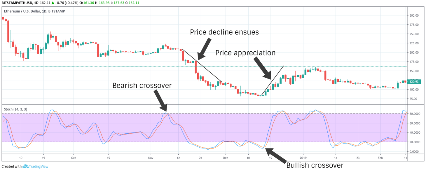
A bullish divergence occurs when the price makes a lower low while the oscillator registers a higher low. Whereas the price making a higher high while the oscillator swings to a lower high indicates bearish divergence. Watch out for breakouts and breakdowns in these scenarios above or below the midpoint and potential signal line crossovers. The price breaking past the most recent swing high in a bullish divergence and the most recent swing low in a bearish divergence are also confirmations of a reversal.
The inverse of bullish and bearish divergences are what Lane refers to as bull and bear set-ups.
In a bull set-up, the oscillator swings to a higher high even as the price makes a lower high. Despite the price swinging to a lower high, market momentum is still surging and the price will likely appreciate further.
A bear set-up is when the oscillator swings to a lower low while the price holds at a higher low. In this scenario, although the price diverges upward, progressive downward momentum indicates that a sustained upward rally is unlikely.
There are two other variations of the oscillator, slow and full versions. In the slow version, a 3-period smoothed SMA of %K is used to streamline the %K line. The full version is fully customizable where traders can set custom look-back and smoothing periods.
A derivative of the stochastic oscillator, StochRSI, was explained by Stanley Kroll and Tushar Chande in their 1994 book, The New Technical Trader, which applies Lane's oscillator to Wilder's Relative Strength Index (RSI) instead of the price. StochRSI is therefore a momentum oscillator of a momentum oscillator.
StochRSI shows the relative position of RSI with respect to its high-low range for a given set of periods. It is calculated using the same formula as the stochastic oscillator, except that the price values are replaced by RSI values.
Spotting and Confirming Signals
Let's say there is a bullish divergence on the directional movement index. Should you trade it? Not yet. However strong a signal, it's imperative to seek as many confirmations as possible by looking at complementary signals.
Does this divergence on the directional movement index mean anything? Only if ADX and SAR indicate a trending market. With no noticeable trend, we know that the divergence is likely of no consequence in a ranging market. But a trend may soon take shape, therefore it's important to keep an eye on… OBV perhaps?
To illustrate how to collate signals to inform our position, we're going to take the ETHUSD chart below, from April-May 2018, and try to determine a medium to long term position based on moving averages and RSI.
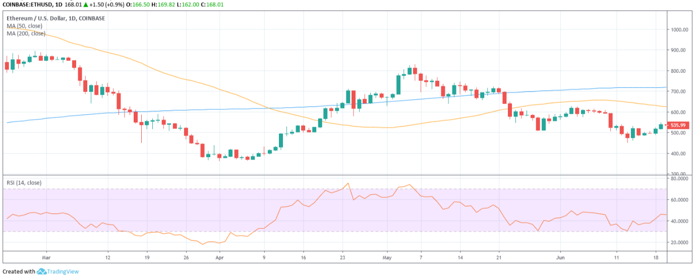
As I'd expect you to have noticed, with you now being familiar with how to interpret these indicators, there's a vicious death cross on the moving averages and a bearish divergence on RSI.
On the 10th of April, the 50-day MA crosses below the 200-day MA. If any signal is strong enough on its own to warrant predicating a trading strategy upon, it's probably the 50/200 day crossover as this signal, particularly in a trending market, almost always foreshadows a trend reversal.
But hold your horses! The moving averages are diverging bearishly alright, but the price is still appreciating at great velocity. What do we do now? Do we trust the price action or moving averages? Neither! We solicit sage counsel from the most effective momentum oscillator, Relative Strength Index.
Help us out here, RSI!
Even as the price continues to trend upward, peaking in the first week of May, there's a divergence on RSI at the exact time period. RSI behaviour confirms the death cross signal from moving averages that a reversal is imminent, which means it's time to abandon this ship, pronto!
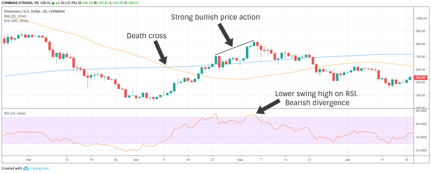
We confidently take a short position towards the end of the first week of May.
Sure, we could use more signals here to confirm our position but in this scenario, that would be quite redundant. When we talk about confirmations, we're not necessarily speaking of every indicator being perfectly concordant, which almost never occurs, but more specifically about the quality of these confirmations. A golden cross or death cross and concurrent RSI divergence are signals of the very highest order.
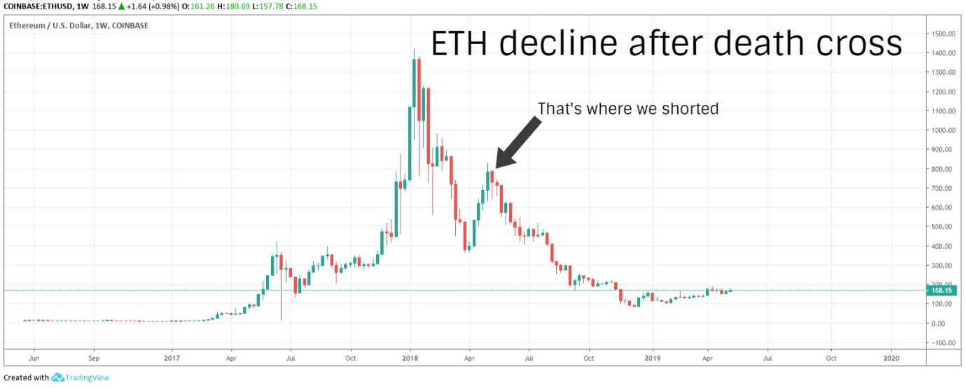
So how would this short position on ETHUSD have turned out for us? Suffice to say, Ethereum has not returned anywhere close to these price levels a year later and was trading at an 18-month low of $83 USD in December 2018. Hey presto!
Crypto Trading Part IV: Candlestick Patterns
Analysts use chart patterns and technical indicators to glean a great deal of insight regarding trading activity over a sequence of trading periods. But for fewer trading periods and shorter time scales, these insights can often prove to be of limited consequence. In recent years, candlestick patterns have become the most popular tool for short-term traders. Candlestick patterns are also used in conjunction with chart patterns and technical indicators as further confirmation for expected breakouts.
We've learned the basics of a candlestick chart in the first part of this guide. We're familiar with the anatomy of a candlestick, we also know what bullish and bearish candles are and what they look like. It's now time to delve a little deeper.
Candlestick charts comprise more information for an individual trading period than any other type of chart. The shape and size of a candlestick and the relationship between the upper wick, the body and the lower wick can speak for how the market forces stacked up against each other and whether the buyers or sellers were in control of a trading period. This information is then interpreted within the context of preceding price action and adjacent candlesticks to determine likely short-term price movements.
Single Period Patterns
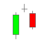
Short Day
An uneventful trading period. The price moved very little from open to close and the period's trading range was rather brief. Regardless of the colour of the body, this type of candlestick on its own means that both bulls and bears are holding fire for the time being.
Long Day
A highly intense trading session in which the price moved significantly from open to close. A green body means the buyers dominated the session and is considered to be very bullish, while a red body represents complete control on the part of sellers and is a sign of strong bearish momentum.
Spinning Top
A neutral pattern regardless of the colour of the body. The body of the candlestick is similar to a short day but the shadows indicate a more significant trading range. Buyers and sellers traded some decent blows but the session ultimately closed near its open.
Long Shadows
The colour of the body is not particularly significant for this pattern, only whether the body resides near the top or the bottom.
A close near the top of the session's range with a long lower shadow is considered bullish. Although sellers tried to take control of the session, buyers ultimately pushed the price back up to close the session on top. Conversely, a close near the bottom with a long upper shadow is bearish, meaning that sellers managed to sway the session back in their favour, seeing off a fleeting foray from buyers.
Marubozu
A Japanese word translated as ‘shaven head', marubozu only has a body without noticeable shadows. This pattern forms when the open and close of a session are equal to the high and low.
When the session's open equals its low and close equals its high, it is represented by a bullish green marubozu. Buyers dominated the session from start to finish. A red marubozu is bearish. The session's open equals its high and close equals its low, meaning that sellers decisively trounced buyers during the period. The longer the body, the greater the momentum.
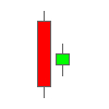
Hammer
A pattern which forms following a spell of declining prices. The session closes near the top with no upper shadow and a lower shadow that is at least twice as long as the body. Hammer indicates that buyers are starting to fight back and is a bullish reversal pattern regardless of colour of the body. The only caveat is that the next candlestick needs to close higher in green to validate the pattern.
Hanging Man

The hanging man is morphologically identical to the hammer, only that we call it hanging man when it forms after a spell of advancing prices.
Like the hammer, it can be either green or red. In an uptrend, the hanging man is seen as a warning, short across the bow if you will, that although buyers managed to rescue the session towards the close, sellers are starting to fashion a reversal. Hanging man becomes a valid bearish reversal signal only if the next candlestick closes lower.
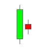
Inverted Hammer

An upside down hammer following a downtrend, considered a bullish reversal pattern only if the next candlestick closes higher. Although the session ultimately closed near its open, the long upper shadow of an inverted hammer is an early indication that buyers may be starting to challenge sellers.
Shooting Star
Looks exactly like an inverted hammer but forms in an uptrend and is therefore considered to be bearish. Despite further continuation of uptrend, as shown by a long upper shadow, the session closed near the bottom of its range. An indication of weakening upward momentum.
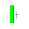
Doji
A neutral cruciform pattern which indicates either incertitude or a state of equilibrium. Despite trading high and low, the session closed almost exactly where it opened. The length of the upper and lower shadow may or may not be equal. Doji can also indicate relenting momentum or potential reversal when it forms adjacent to other patterns.
Dragonfly Doji

A doji with a long lower shadow and no upper shadow in which the open and close are equal to the high for the session. When this pattern forms in a downtrend, it's considered to be an indication of bullish reversal.
Gravestone Doji
A doji with a long upper shadow and no lower shadow in which the open and close are equal to the low for the session. Gravestone doji in an uptrend is a sign of bearish reversal. With both dragonfly and gravestone doji, the length of the shadow is a good measure of the momentum behind a reversal.
Multiple Period Patterns
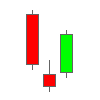
Bearish Engulfing
A two-period bearish reversal pattern in an uptrend. A candlestick with a short green body is followed by one with a longer red body. The body of the second candlestick fully engulfs the first candlestick's body, but not necessarily the shadows, thus the pattern's name.
Bullish Engulfing
The inverse of bearish engulfing, bullish engulfing is a two-period bullish reversal pattern in an uptrend. The first candlestick has a short red body and the second candlestick has a longer green body which fully engulfs the red body.
Engulfing patterns are among the strongest indications of a reversal. Not only do they depict a shift in the tide but significant attendant momentum.
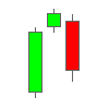
Harami
A two-period reversal pattern, potentially. Harami is Japanese for pregnant.
As with some two-period patterns, the candlesticks may or may not be immediately adjacent. They only need to be sufficiently proximate.
A bullish harami forms in a downtrend when a long red candlestick is followed by a small green candlestick (as shown above), where the complete trading range of the latter is within the body of the former.
In a bearish harami, shown below, a small red candlestick is fully contained within the body of the preceding longer green candlestick.
Harami patterns typically indicate relenting momentum after a strong trend. The reversal from a harami is considered complete only if the next candlestick closes favourably, meaning that it's the same colour as the second candlestick.
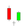
Harami Cross
A two-period pattern very much like a harami, except that the second candlestick is a doji.
Harami cross is considered to be an indication of weakening momentum or indecision rather than a reversal. For the pattern to qualify as a valid reversal, a third candlestick following the doji must be in concurrence.
When a harami cross forms in an uptrend, the candlestick after doji must close below the doji’s trading range in red. If it closes above in green, that could mean the harami cross was simply a brief consolidation before further continuation of uptrend.
In a downtrend, the candlestick which follows the doji must close above the doji’s trading range in green to validate a bullish reversal.
Tweezer Top
At least two candlesticks with even tops, considered a potential reversal pattern in an uptrend.
As price gets repeatedly rejected at the same level, this evinces strong resistance. With more candlesticks forming even tops, it becomes more and more likely the price cannot surpass this level. Reversal is confirmed by a bearish close in red below the midpoint of the first candlestick in the pattern.
Tweezer Bottom
The inverse of tweezer top, a potential reversal pattern in a downtrend. Tweezer bottom is formed by at least two candlestick bodies with even bottoms.
Successive candlesticks encounter rejection at the same low, indicating strong support. Bullish reversal is complete only when the pattern is followed by a higher close.
With both tweezer patterns, only the top and bottom of the candlesticks' bodies are taken into account to validate the patterns, without regard for the shadows.
Dark Cloud Cover
A two-period bearish reversal pattern in an uptrend.
A long bodied bullish candlestick is followed by a bearish candlestick which closes below the midpoint of the first candlestick's body. The second candlestick must close near the session’s low without too much of a lower shadow.
Piercing Line
A two-period bullish reversal pattern in a downtrend. The inverse of dark cloud cover.
A long bodied bearish candlestick is followed by a bullish candlestick which closes above the midpoint of the first candlestick's body.
Dark cloud cover and piercing line patterns are quite similar to bearish and bullish engulfing patterns but the momentum behind the reversal is less significant.
Morning Star
A three-period bullish reversal pattern, which differs from piercing line by the presence of a middle candlestick which is a short body.
The first candlestick has a long red body. The second candle represents a relatively uneventful session, which can be red or green. The pattern is complete and a bullish reversal is confirmed when the third candlestick closes above the midpoint of the first candlestick.
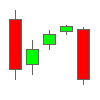
Evening Star
The inverse of morning star. A three-period bearish reversal pattern, which differs from dark cloud cover by the presence of a middle candlestick which is a short body.
A long green body is followed by a short green or red body. A third candlestick closing in red below the midpoint of the first candlestick confirms a bearish reversal.
Morning Doji Star
A morning star pattern where the middle candlestick is a doji.
The doji indicates a period of indecision among traders before eventual bullish reversal. For the pattern to become valid, the third candlestick must close above the midpoint of the first.
Evening Doji Star
An evening star pattern where the middle candlestick is a doji.
The pattern is confirmed and a bearish reversal is complete only if the third candlestick closes below the midpoint of the first.
Three White Soldiers
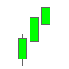
A three-period bullish reversal pattern which consists of three long green candlesticks following a spell of declining prices.
To qualify as a valid reversal, each candlestick in the pattern must close near the session's high, with only a short or shaved upper shadow, and be bigger than or at least the same size as the preceding candlestick.
Three Black Crows
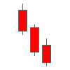
A three-period bearish reversal pattern in an uptrend, comprising three long red candlesticks.
Each candlestick in the pattern must close near the session's low, without much of a lower shadow. The second and third candlesticks must be at least the same size as the preceding candlestick.
In both three white soldiers and three black crows patterns, the size of the bodies and the shadows are indicative of the force behind a reversal. These patterns usually appear at long-term support/resistance levels or under overbought/oversold conditions.
Rising Three Methods
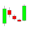
A five-period bullish continuation pattern.
The first period is a long green candlestick, followed by three small red candlesticks contained within the body of the first. This is then followed by another long green candlestick.
The pattern indicates that although sellers tried to peg back and reverse the trend, momentum was insufficient to complete a reversal. The fifth candlestick closing higher than the first is essential to confirm that an attempt at reversal fell through.
Falling Three Methods
The inverse of rising three methods, a five-period bearish continuation pattern.
A long red candlestick is followed by three small green candlesticks contained within the body of the first and another long red candlestick. The fifth candlestick must close below the body of the first to confirm continuation of downtrend.
Candlesticks Rule of Thumb
Now that's obviously a lot of patterns. Having to memorize everything can prove to be a pretty daunting proposition. A neat little candlesticks hack would be handy, right? I think I've got just the ticket!
Let's just forget all the fancy names for candlestick patterns for a minute. What we need is an easy way of determining why any particular pattern is considered bearish, bullish or neutral. What really informs the way we interpret the relationship between a session's open, high, low and close? That should help us at once recognize what any given pattern signifies.
We only need answers for three simple questions to know what any single candlestick or successive candlesticks indicate with regards to the balance of market forces,
1 – What was the preceding trend? This will inform us if there is a trend to be reversed.
2 – Where did the session close with respect to its trading range? A close near high is bullish and a close near low is bearish. Longer shadows represent brusque price rejections.
3 – How big was the candlestick's body relative to adjacent candlesticks? Larger body indicates greater momentum, effecting a major shift from open to close. A small body after a strong trend is a sign of either relenting momentum, respite or indecision.
In a declining trend, a long-bodied close near the top of a session's range is a sign of strong bullish reversal. Likewise, in a rising trend, a long-bodied close near the session's low represents a firm bearish shift.
Now it's important to note that although candlesticks pack a lot of information about each session, they don’t quite tell us everything.
A candlestick offers no insight into the chronological sequence of price action during that particular session. We know where the session opened, closed, the session's high and its low but not how the price moved ad interim or where it was at any given time during the session between open and close. By using a line chart, we can learn how a particular session played out from open to close.
Applying Candlestick Patterns
Just like chart patterns, candlestick patterns don't always play out. The ability to ascertain the likelihood of a pattern coming to fruition comes with experience.
Candlestick patterns become more significant when they confirm other indicators. In scenarios where a price breakout or trend reversal is imminent, they can help us identify the most opportune entry or exit point.
Take the example of the BTCUSD chart below,
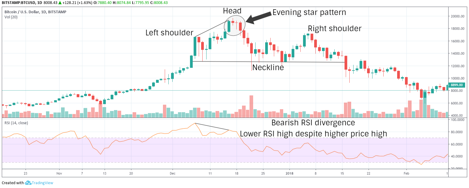
RSI stops breaking down just above 40 during the second week of November, enters overbought territory within a week and keeps steadily surging for a month.
RSI stays overbought for weeks and we know a bearish reversal is imminent but there's no indication of a reversal. It's obvious that sell pressure is non-existent at this point.
However, in the second week of December, price makes a new high but RSI diverges to a lower high. Soon enough, here comes confirmation of sell pressure in the form of an evening star candlestick pattern.
Hang on! There's a doji between the star and the last candlestick in the pattern. Candlesticks in certain patterns need not always be immediately adjacent, as we've covered previously. Doji is neutral and simply indicates a period of indecision. In these scenarios, we can merge two candlesticks, star and doji, and the result would still be a star.
The last candlestick closes a long way below the midpoint of the first candlestick's body. Together with bearish RSI divergence, this constitutes strong indication of bearish momentum gathering steam.
We can take a short position here with a stop at the most recent high. We don't yet know if the head and shoulders (H & S) pattern is going to complete but despite a couple of fleeting rallies, RSI continues to diverge bearishly so we'll stick to our guns.
In the second week of January, H & S top pattern does play through and the neckline is broken with attendant surge in volume. This is just further confirmation of our position. We can now move the stop to the most recent swing high within the pattern to cover our profits.
Different Ways to Trade

Micro Trading or Scalping
Micro Trading or Scalping involves trading small price movements and accumulating profits throughout the day. Scalpers use either 5 or 15 minute charts, identify a local range and typically trade based on candlestick patterns. The practice is quite risky and one bad trade can undo the profits gleaned from numerous successful scalps.
Day Trading
Day Trading is the practice of identifying the trading day's potential range through various indicators and capitalizing on price fluctuations. Day traders use hourly charts to set their entry and exit positions. Common tools used are candlestick patterns, momentum and volatility indicators.
Swing Trading
Swing Trading is a type of short to mid-term trading, lasting anywhere between a few days to a few weeks. It involves identifying local support and resistance levels for a short-term trading range, typically during a consolidation spell, and riding the waves between high and low within the range.
Position Trading
Position Trading, known as HODLing in crypto jargon, is the practice of… well… not trading at all but investing in an asset based on a combination of fundamental analysis and weekly or monthly charts with a view to realising long-term profits.
Margin Trading
Margin Trading is commonly used by day traders and swing traders. Using leverage borrowed from an exchange/broker, margin trading allows betting on the price of an asset going up (long) or down (short) with more money than is possible with spot trading. The trader’s own funds used towards a margin trade order is their margin and leverage refers to funds borrowed from the exchange or broker.
Profits and losses are multiplied by the ratio of leverage borrowed to the trader's margin. If the price moves unfavourably to equal the percentage of the margin, the trader's position gets liquidated and the funds are lost. Although margin trading can be highly profitable, using leverage more than three times the margin is not recommended and a tight stop loss order is imperative at all times.
Algorithmic Trading or Algo Trading
Algorithmic Trading or Algo Trading is an automated trading method using trading bots which carry out orders based on pre-specified criteria or algorithm. The trading algorithms are typically based on moving averages, range, momentum and volume indicators.
Additionally, algorithmic traders also look for arbitrage opportunities which are too complicated to execute manually – simultaneously buying an asset for a lower price in one market and selling for a higher price in another. Originally popular among hedge funds, investment banks et al., recent technological advances have made this type of trading more readily accessible to retail traders.
Ten Commandments of Trading

1 – Study Charts
Study a lot of charts, then some and then some more. There's only one way to perfect the ability to read charts – through reading charts. Do not start trading with real money until you're sure you are fully capable of identifying patterns in any given chart.
2 – Refine Your Methods
Paper trade to refine your methods. If you're unable to resist the itch to trade while perusing charts, you can test yourself by paper trading live charts in real time. It's not real money, there's nothing to lose and you'll get to figure out whether or not your methods work.
3 – Trend is your friend.
Never bet against the trend in a trending market without multiple confirmations of a reversal. Never!
4 – Stop loss is your saviour.
There's no telling when the market may turn on you. You may think a pattern complete but a retest following breakout could cave. The only way to protect your money is stop loss. Always use a trailing stop loss order to protect profits earned.
5 – Avoid Complacency
One swallow does not a summer make. Beginner's luck is a real thing in trading. One good trade does not make you a pro trader and your last trade entails no implication on the next trade. Successful traders avoid complacency, stay dispassionate and retain an equanimous disposition at all times.
6 – Avoid Trade Patterns
This is not a hill for you to die on. Knowing when not to trade is as important as knowing when to trade. This is the fundamental reason why good traders lose money. They tend to get carried away and trade patterns incessantly without confirmation. Be patient and wait for the right opportunities to trade.
7 – Greed Kills
Another reason perfectly capable traders fail to retain their profits is greed. Greed can be good, but within reason. Set your targets, stick to them, take profits, get out and wait for the next good opportunity.
8 – Bitcoin is King
Bitcoin is the king, altcoins merely his subjects. Altcoins derive liquidity and exposure largely through Bitcoin, which means altcoin trends invariably follow Bitcoin trends. Without Bitcoin, altcoin markets may even cease to exist.
9 – Avoid Chasing the Moonshot
Unregulated markets necessitate greater caution. This is particularly true for low-liquidity markets which can be rabidly erratic. Therefore, it's best to avoid trading obscure cryptocurrencies in the hope of that elusive ‘moonshot'.
10 – Not Your Keys, Not Your Bitcoin
You may not get to keep your profits if you don't keep your keys. Don't leave your money on a centralized exchange, however secure and trusted the exchange may seem to be, any longer than you absolutely need to. Your coins don't belong to you if you don't control the private keys to your address.
With that, you're all set to embark on your trading voyage. Fair trends and following sats!
Useful Links
Buy Bitcoin – Coinbase, Bitstamp
Buy Bitcoin (peer-to-peer) – Bisq Network, LocalBitcoins
Buy Altcoins – Binance, OKEx, Huobi Global
Charts and Paper Trading – TradingView
Margin Trading – BitMex, Deribit

Bitcoin Price Starting to Recover After Sharp Drop; Top Alts Ethereum and Litecoin Are Struggling

Bitcoin (BTC), Ethereum (ETH), and Litecoin (LTC) Price Prediction for Today’s Top Cryptocurrencies

Ripple Price Analysis: XRP/USD Primed For Further Gains

Bitcoin Price Analysis: BTC Surging, Next Stop Could Be $9,750

Ethereum Price Analysis: ETH Approaching Significant Support Area

Bitcoin Price Analysis: BTC Setting Up For Another Bull Run

Crypto Media Site CCN Announces It’s Shutting Down After Latest Google Update
Bitcoin (BTC), Ethereum (ETH), Litecoin (LTC) and Bitcoin Cash (BCH) Price Analysis June 10th

Facebook and the CFTC Discuss The Future of the GlobalCoin
