Cryptocurrency Investing
Cryptocurrency Traders Beginner’s Guide to Reversal Chart Patterns

A Beginners Guide To Reversal Chart Patterns
The crypto market is full of confusing concepts which we can find difficult to wrap our heads around.
Reversal Chart Patterns are one such topic.
However, before we get into this domain in detail, it can be useful to define and get a brief understanding of what these diagrams actually are.
In their core sense, we can think of reversal chart patterns as being one of the major pillars of technical analyses within the crypto sector. Not only do they allow us to visualize a shift in asset demand and supply in real-time but they can also be used to derive buy/sell signals which can help us maximize our profits and overall ROIs.
Table Of Contents
To be even more specific, a reversal chart pattern indicates the price trend that a currency is likely to follow in the near future. In this article we will cover all of the major Reversal Chart Patterns that are commonly used by crypto traders and investors all across the globe.
Let us begin
1. Double Bottom
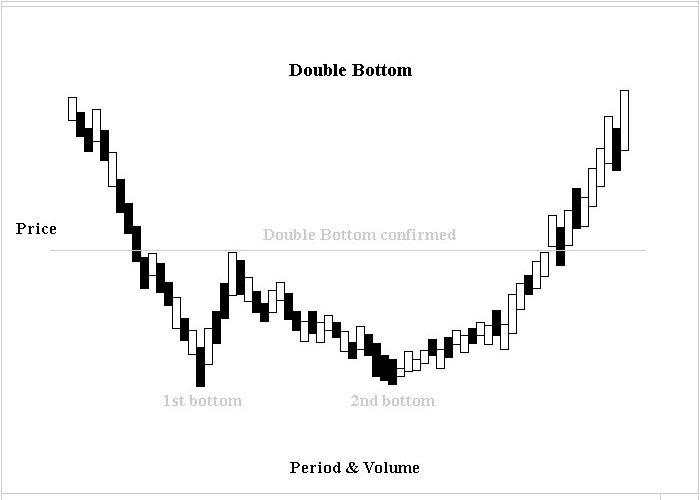

This chart is observed commonly when the market is nearing the end of a bear run. In terms of its visual form a Double Bottom chart resembles a “W” shape.
The pattern is formed as and when two consecutive troughs that have roughly the same lows and are separated by a local peak start to come together.
It is also worth mentioning that when we draw a line horizontally across the local peaks within this chart, the pattern’s neckline acts an area of resistance through which the asset value must eventually break through.
Lastly, a Double Bottom Graph ends when the price of the commodity in question goes beyond the existing neckline— which also indicates that the value of the asset is set to rise in the near future.
Key points worth noting include:
- Pattern Price Target = Highest Peak + (Highest Peak – Lowest Valley)
- Percentage of Time Pattern Hits Price Target – 66%.
2. Rounding Bottom
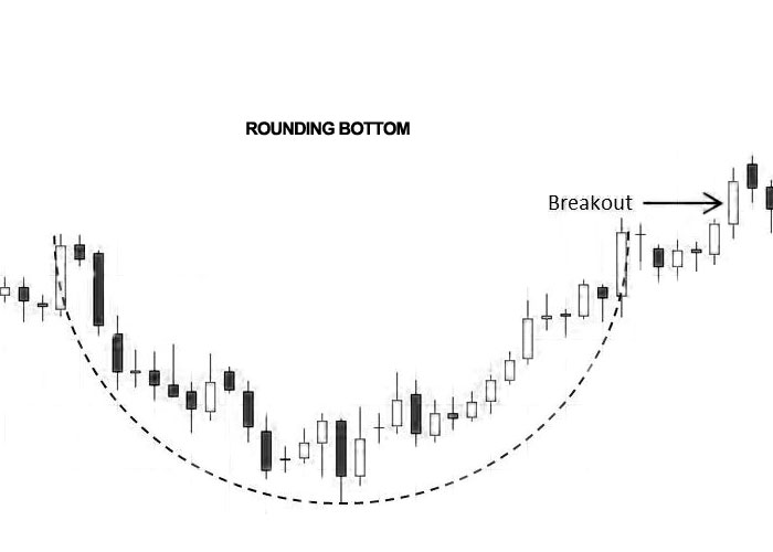
A Rounding Bottom chart as the name suggests looks like a ‘U’ shape.
It provides users with bullish formation that predicts the reversal of a current downtrend. As a result of this, analysts who are able to understand the data being presented can easily see how long the current trend will last (be it a couple of weeks or even some months).
Key points worth noting include:
- Pattern Price Target = Right Saucer Lip + (Right Saucer Lip – Lowest Valley)
- Percentage of Time Pattern Hits Price Target – 57%
3. Head & Shoulders
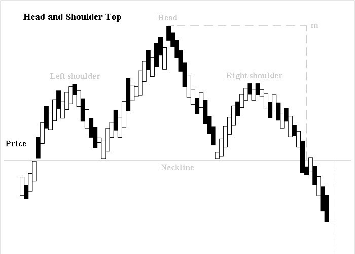
This is one of the most commonly used reversal charts by data analysts and market speculators.
Head and Shoulders is designed to provide users with bearish information that predicts the reversal of a current uptrend. From a visual standpoint, the pattern resembles the shape of a raised head that has its shoulders on either side.
Also, when we draw across the bottom of each side of the diagram, we can locate an area through which the price of a chosen asset has to eventually drop. Once this happens, the pattern starts to reach its completion and thus we can infer the time when a currency will start to dip.
Key points worth noting include:
- Pattern Price Target = Breakout Price – (Highest Price In Head – Neckline Measured Vertically from Head)
- Percentage of Time Pattern Hits Price Target – 55%
4. Inverse Head and Shoulders
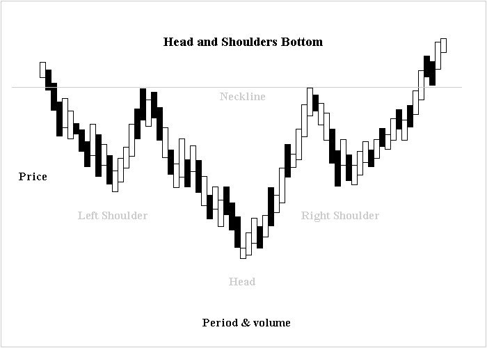
As can be inferred from the name, this chart is simply the inverse of the Head and Shoulders pattern. It helps us visualize bullish formations which can then be used to predict the reversal of a current downtrend.
In terms of its shape, we can see that the pattern resembles an upside-down head accompanied by a higher shoulder on each of its sides.
When a connecting neckline is drawn across the top left and right shoulder of the diagram, we are presented with an area of resistance through which the price of an asset must eventually breakout.
As and when the price goes beyond the neckline on the right shoulder, the pattern is completed. This breakout indicates the price will likely proceed higher.
Key points worth noting include:
- Pattern Price Target = Breakout Price + (Neckline Measured Vertically from Head – Lowest Price In Head)
- Percentage of Time Pattern Hits Price Target – 74%.
5. Double Top
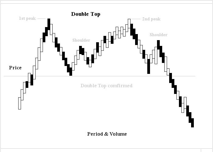
A commonly occurring chart which is observed when the market starts to near the end of a bull run.
To be more specific, we can see that Double Top serves as a bearish formation that predicts a reversal of a current uptrend. Visually speaking, this pattern is formed when we obtain two consecutive peaks with roughly the same highs (and are separated by a local low).
Also worth mentioning is that the diagrams neckline acts as an area of support in which the price must eventually break below. Lastly, when the chart has finished forming completely, we can infer if there will be a future value decline of the currency at hand.
Key points worth noting include:
- Pattern Price Target = Lowest Valley – (Highest Peak – Lowest Valley)
- Percentage of Time Pattern Hits Price Target – 72%
6. Rounding Top
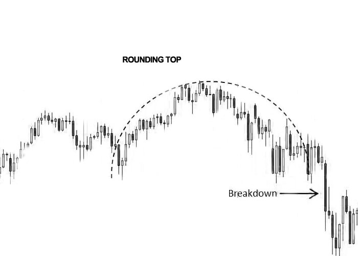
This is the last reversal chart on our list. It essentially represents a bearish formation that helps us infer the reversal of a current uptrend.
Due to its U shape, this chart is extremely easy to spot and identify. Additionally, it also features a long-term reversal formation that normally lasts for weeks or months.
Key points worth noting include:
- Pattern Price Target = Right Saucer Lip – (Highest Peak – Right Saucer Lip)
- Percentage of Time Pattern Hits Price Target – 24%
In Closing
While not completely accurate, reversal chart patterns can be used to derive powerful insights into the movement of an assets value in the market.
These charts can also be used to forecast dramatic shifts in the supply and demand of a particular currency, thus helping us to determine when to pump or dump our holdings (so as to maximize our profits).